
There are plenty of ways to boost website conversions. From optimizing content to improving CTA button design, there’s a lot you can do to make your ecommerce site more successful at securing sales.
But how about product pages? Are there any strategies that work best when directly applied to the online spaces where sales actually happen?
Well, it turns out that there is such a thing as a formula for a high-converting product page. It rests on a skeleton of research and consumer behavior. And, when applied just right, it holds the potential of increasing ecommerce conversions from the average of ~2% to numbers that can successfully drive growth.
So what are the elements that go into a high-converting product page? And are there any rules that marketers and designers must follow? Let’s find out.
Design & Aesthetics
When aiming to boost sales on an ecommerce website, you need to remember that investing in design pays off. And you might already be familiar with some studies that have proven the importance of web design.
For example, a 2020 research paper revealed that website aesthetics had a positive impact on:
- the perceived quality of online services
- consumer trust
- consumer satisfaction
- buying motivation.
Moreover, the same study found that an aesthetically pleasing web design would be more likely to lead to sales, site revisits, and product consideration.
So, it’s only natural that ecommerce business owners, designers, and marketers should look for ways to improve product page design to achieve high conversion rates. When doing this, there are two essential elements to consider.
Layout
How information is presented and organized on a web page can make or break conversion rates.
Research into consumer behavior has shown that there are specific ways in which people consume online content, giving designers valuable information about the anatomy of a high-converting product page.
For example, a 2018 eye-tracking study from the Nielsen Norman Group revealed valuable information about the way people view web pages. The research team found that web visitors spend 103% more time focusing on content above the page fold.
This is why well-designed pages – especially homepages, landing pages, and product collection pages – must present their value propositions and high-value CTAs in the hero section.
For instance, the WhatsGood website applies this knowledge, ensuring that it leaves a stellar first impression before presenting specific user benefits to its web visitors.

When looking at product page design, you have to remember that layout may be a valuable part of a high-converting page’s anatomy. But it’s not the only design feature that matters.
Repetition
In addition to webpage element placement, it’s also not a bad idea to consider the frequency at which high-value elements appear on ecommerce websites and product pages.
For example, a 2013 research study proposed that one of the best ways to increase conversions on ecommerce websites was to employ repetition and gradually increase persuasion levels throughout the product/landing page.This is a common strategy for SaaS product pages where designers only have a single product to sell. The limited amount of items for sale means there is much more pressure to leave a positive impression on web visitors and inspire them to take action. Repetition can be an effective technique, especially when combined with well-worded CTAs, as in the case of Optimal Workshop.
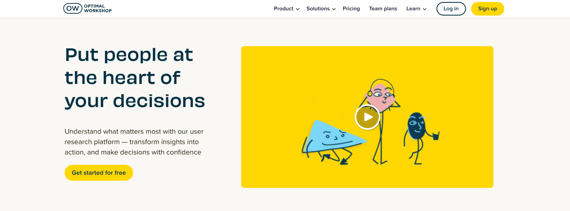
Source: Optimal Workshop
Visuals
When aiming to boost conversion on product pages, you’ll have to choose how you present relevant information to your web visitors. But this doesn’t mean you should forget about what you’re showing them in the first place.
Presentation is the key when it comes to online shopping platforms. It is extremely important that the product page and the product itself look appealing because oftentimes, it is a deciding factor whether a prospective customer will choose to purchase from your website or not. Having high-quality and realistic product images is vital for this as it forms first impressions on the product and lets viewers know your product is worth buying. Editing product images to make them appealing and look accurate to their real-life counterpart is no easy feat and should only be done by experienced professionals. Hiring editors are definitely helpful, however, opting for online services like clipping path service is much more cost-effective and assures high quality.
You see, exceptional design is nothing without great content to back it up.
If you consider people’s favorite way to shop, you’ll find that 46% still prefer visiting a store and having an in-person shopping experience to buying products online. And, in truth, it’s no surprise. Shopping in a physical location allows buyers to see, touch, and try products before committing to them. Conversely, ordering online relies entirely on brand-provided images and product descriptions.
Now, while you may not yet have the opportunity to present web visitors with real-life products they can touch and feel, you can do your best to get the most out of the available formats.
For example, investing in stellar product photography, employing videos, implementing AR technology, or even ensuring that each of the items in your store is shown from a variety of angles is guaranteed to boost conversions.
And if you’re selling something unique or exciting, don’t hesitate to explore alternative ways of showing it off, as done by Spores for its collaboration with Super Boomi.

Source: spores.app
Copy
Moving away from content that boosts ecommerce sales through aesthetic appeal, you have to understand that website copy also plays a role in convincing web visitors to convert.
That is, if you look at the anatomy of a high-converting page, you’ll realize that the layout is the skeleton, the visuals are the muscle, and the copy is the connective tissue that holds everything together.
So what are the exact instances of product page copy which can help you achieve better conversions? Well, on the whole, there are three main areas you need to address.
Product Titles
Considering that consumers have a wide variety of (often similar) products to choose from nowadays, brands need to find ways to single out their offering from that of their competition. Especially when selling in marketplaces like Amazon, where each product category features thousands of almost identical items.
One way to do this would be to choose more exciting product names. Carhartt, for example, calls its midweight softshell jacket “Rain Defender,” which is a definite upgrade from the generic way of describing a clothing item.
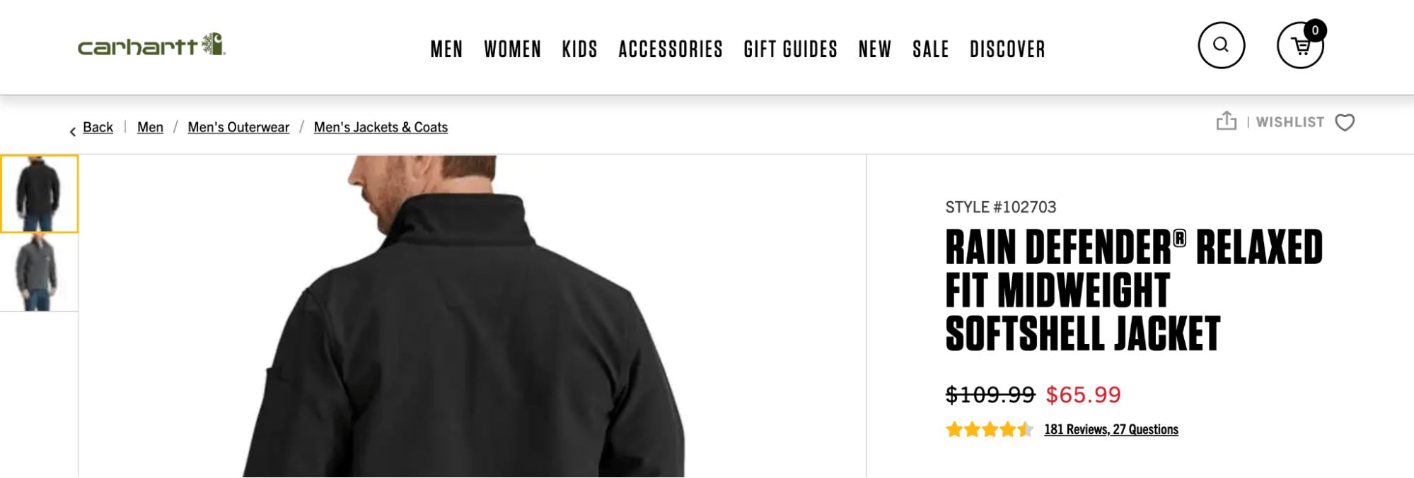
Source: carhartt.com
Product Descriptions
Once you’ve grabbed consumer attention with a product title that promises to remove their pain points, it’s time to present them with a product description that will convince them of the capability of your product in solving their needs.
Most resources agree that the way to do this is to provide information that is:
Specific and detailed – As in the case of Roborock, product descriptions need to be explicit about the features an item brings to the table. In this case, the product page specifies the exact technical properties of the mop function of the brand’s latest release.
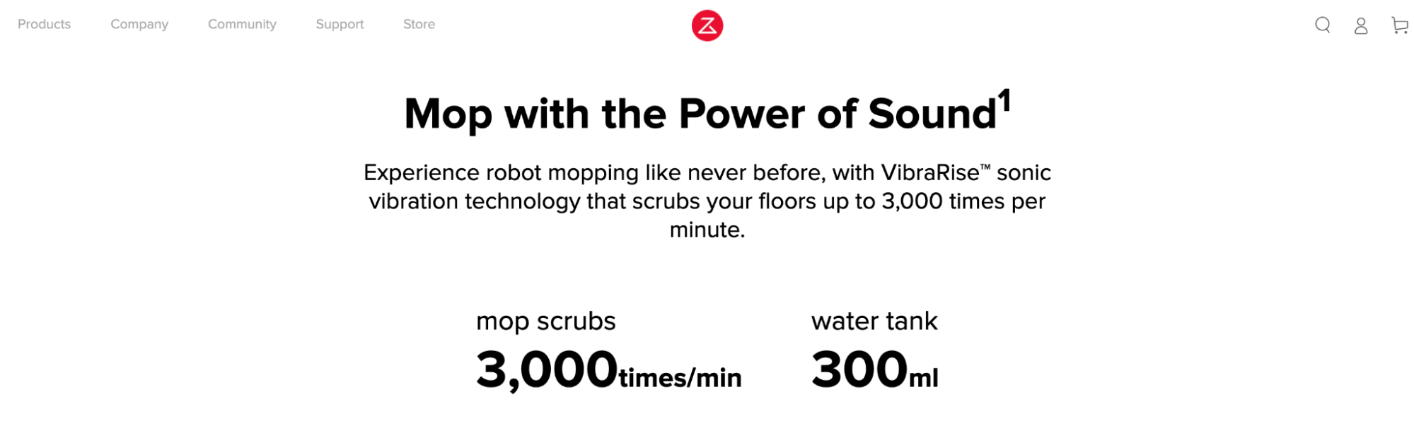
Source: Roborock
Consumer-oriented – The reason why most copywriting resources advise to promote benefits over features is the simple fact that consumers want to make purchasing decisions based on what they get out of the deal. Mrs. Property Solutions understands this, which is why it promotes its services based on the various advantages it offers to potential customers.
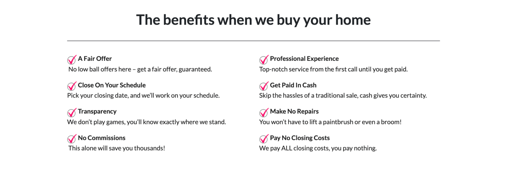
Source: Mrs Property Solutions
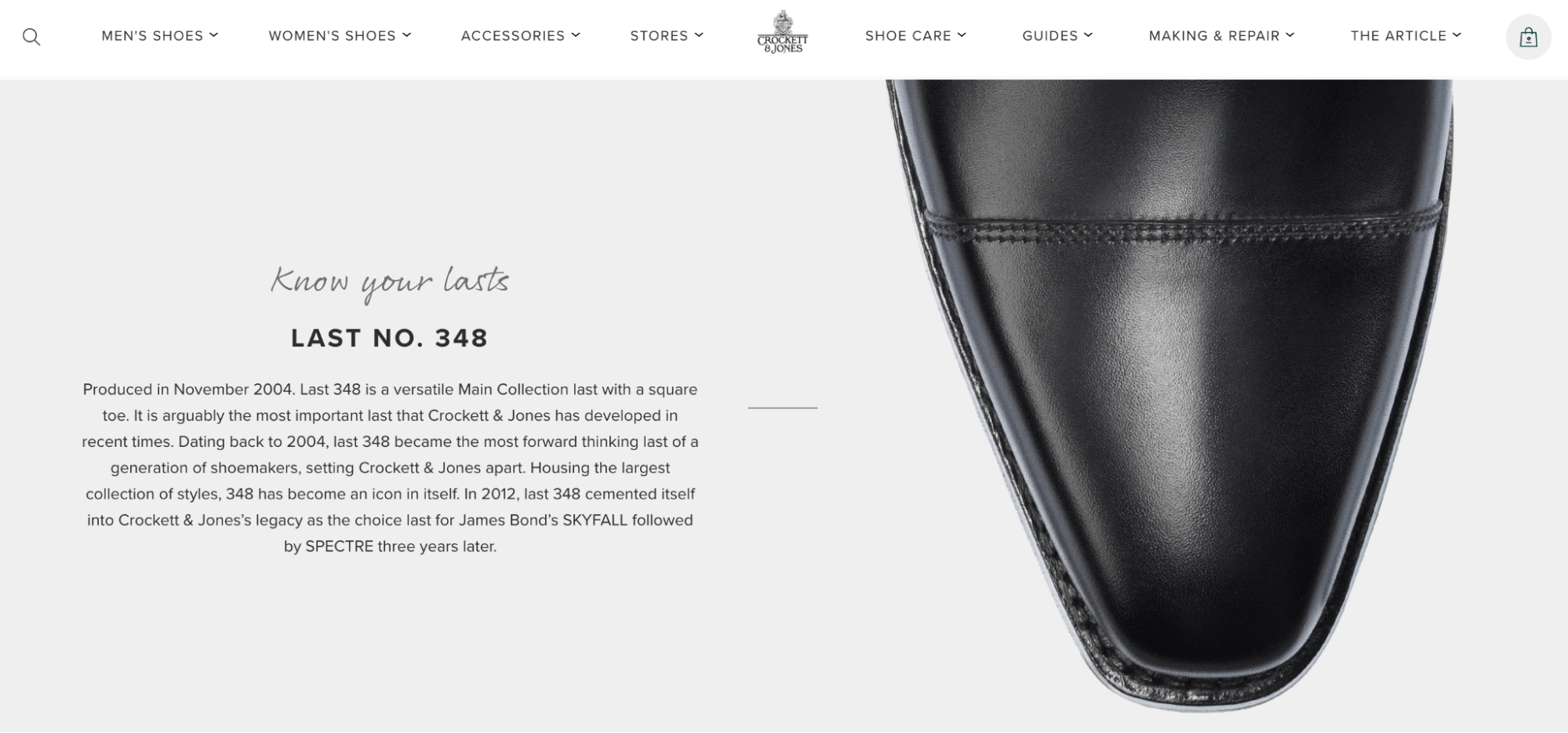
Easy to understand and compare – One common mistake ecommerce brands tend to make is that they assume that all people who visit a product page know what they want and are ready to buy. But that’s not true. More often than not, web visitors are still in the awareness or consideration stage of the buyer’s journey, which means that they need informative copy that’s easy to understand (even without any technical knowledge). For this reason, including size charts, addressing FAQs, and even providing comparisons makes for a super-efficient conversion boosting strategy. It’s what Crockett & Jones does with its “Know your last” section on product pages, ensuring that each customer has the absolute highest chance of finding a fit they’ll be happy with for years to come.
Transparency, Shipping, & Relevant Policies
Finally, as you look for ways to optimize your product pages for conversions, don’t forget that the role of website copy isn’t just to sell products. It must also play a part in instilling a sense of confidence in web visitors. That is, it must prove to them that your brand is the right choice for their needs.
To achieve this effect of trust, consider how product page copy achieves transparency, how effectively it describes shipping and returns policies, and how it deals with consumer privacy.
Something as simple as the banner on the Dale of Norway website can go a long way. The three phrases don’t just state the origin of the garments and advertise a free returns policy. On top of that, they also provide shipping information that can help people shop for Christmas presents. This is how the brand shows that it understands what its customers need. Dale of Norway is clearly ready to do everything it can to provide an exceptional customer experience.
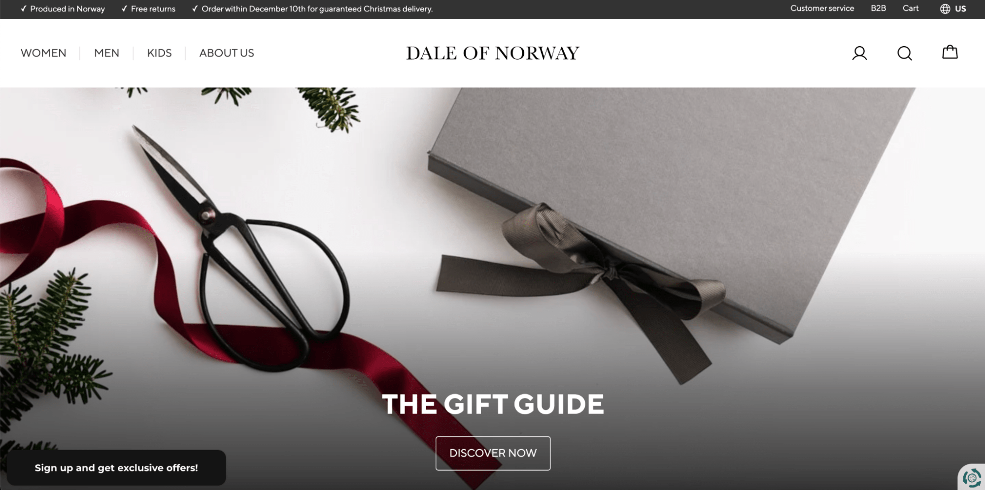
Source: Dale of Norway
Social Proof
Finally, when putting together a product page that aims to convert as many buyers as possible, you have to remember that impressive claims, beautiful visuals, and generous policies mean nothing if you can’t prove that you’ll deliver.
What’s more, research shows that a growing number of consumers seek out instances of social proof before purchasing products online. Review interactions have grown 50% since the start of the Covid-19 pandemic.
With that in mind, you’ll want to look for ways to enrich your product pages with various trust signals. These can range from standard product reviews and ratings to media mentions like the one used on the Unbound Merino site to user-generated content submitted by your buyers.
Source: Unbound Merino
If your brand has some experience behind it, don’t hesitate to reach out to your satisfied customers and ask for personalized testimonials. Or, if your product’s quality plays a role in someone else’s success, why not call attention to it? This is a particularly popular way of displaying social proof amongst SaaS brands like CoSchedule, who don’t always get the opportunity to get specific feedback from their clients.

Source: CoSchedule
Designing a High-Converting Product Page: Final Thoughts
As you can see, the anatomy of a high-converting product page is relatively simple.
As its base, it requires a solid layout that provides an intuitive, consumer-oriented browsing experience. Then it needs a body of flesh in the form of compelling visuals, which are essential in presenting products online. Well-written copy can act as a binder, pulling the content and presentation method together into a whole that appeals to consumers. And social proof acts as the guarantee, showing that you’re committed to delivering great results.
If you want to take a step further, you can, with extra features like countdown timers that play to buyers’ fear of missing out or versatile payment options that minimize consumer hesitation. But note that these are just extras. The real work is done by overall design, visuals, copy, and proof. So make sure to focus on those first.
Once you feel like they’re as perfect as can be, you can move on to advanced methods that won’t just get you more sales but also focus on increasing average order values. That way, you’ll get the absolute most out of every page of your site.