
In 2025, the average conversion rate is around 3%. And, if you follow generalized advice (disregarding industry and niche specifics), this may seem entirely satisfactory.
But the thing is that if you’re converting 3.4% of all web visitors, you’re losing the business of 96.6% of all people who have landed on your website. Some leave the sales funnel early, while others (43.8%) may view a product page. And about 15% may even add a product to their carts — only to change their minds later.
And, sure, such statistics may not mean much in the real world. But the figures above clearly show there’s plenty of room to boost your conversion rates and allow your business to capture more new customers.
So, without further ado, here’s everything you need to know about breaking down conversion barriers, along with some of the best ways to encourage shoppers to take action.
Optimize Calls to Action
One of the primary reasons your site may not be effective at encouraging sales is that your calls to action aren’t fully optimized.
Ideally, CTA buttons should speak to your target audience, encouraging them to take action and invest in your solutions. But the truth is, this can be difficult to achieve if you don’t understand the elements that make calls to action successful.
In general, a conversion-inspiring CTA needs to check three boxes:
- The design has to be appealing in a way that attracts web visitors’ attention and engages them long enough to inspire them to convert.
- The positioning has to align with your prospects’ browsing journey, ensuring that web visitors notice CTA buttons at the right point of their shopping experience.
- The copy has to be action-oriented, primarily by spelling out the benefits/outcomes of converting and encouraging web visitors to make a purchase.
How to Achieve This
The great news about creating a killer CTA button that converts is that it’s not too difficult. In fact, you can accomplish impressive results by adhering to a few ground rules:
- Use colors that provide sufficient contrast against the background (but align with your brand’s visual identity).
- Surround CTA elements with negative space to maximize their noticeability.
- Employ action-oriented language that’s short and to the point.
- Position CTAs in logical, attention-grabbing spots that make sense to your prospects’ browsing journey.
- Don’t hesitate to create more than one CTA, nor to repeat relevant calls to action whenever it makes sense.
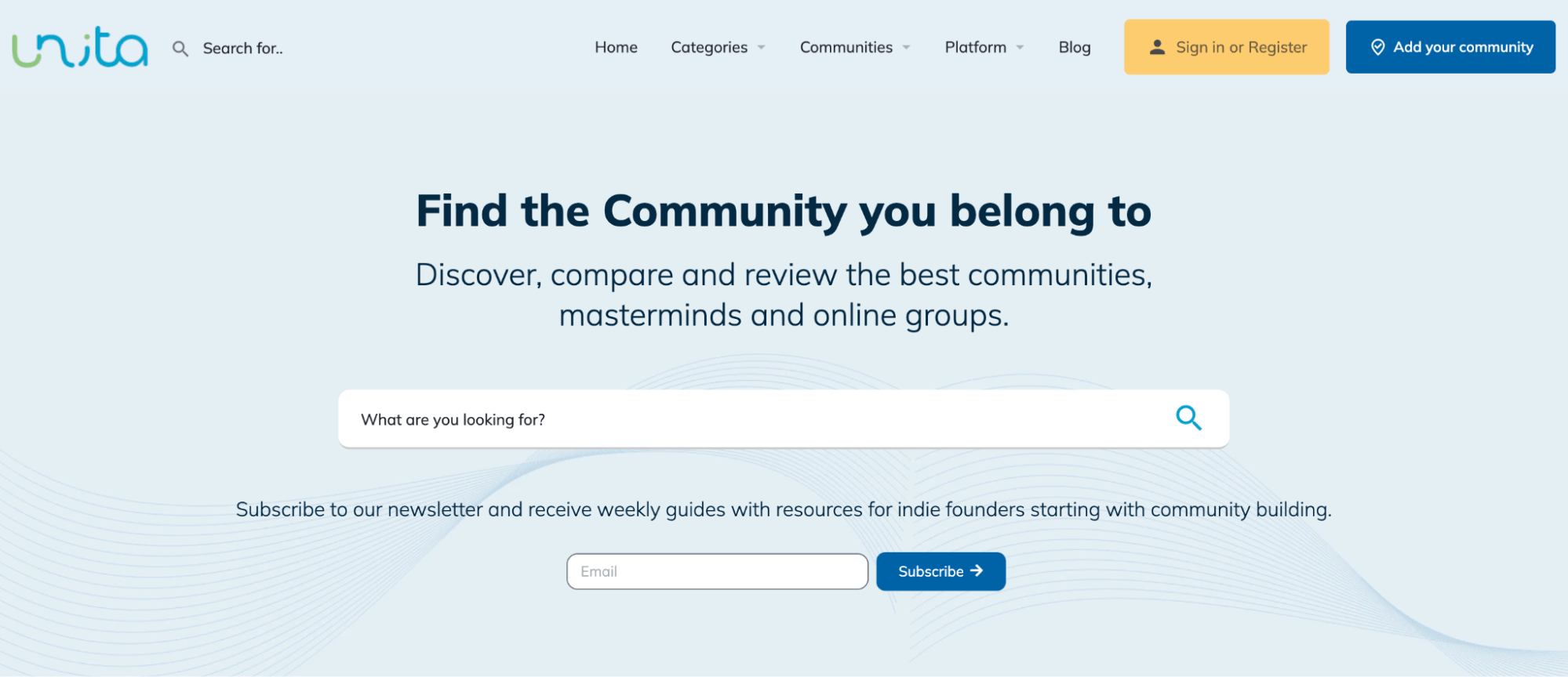
The Unita homepage is an excellent source of inspiration for how to do CTA buttons right. It reserves the most prominent spot on the website — the hero section — for the two most important CTAs. It utilizes color, contrast, and design in a way that ensures attention-grabbing visibility. Finally, the copy is simple but logical. It does a great job of telling web visitors precisely what they need to do to access the benefits of Unita’s services.
Address and Remove Perceived Conversion Risks
In some cases, conversion barriers don’t come down to CTA button design or copy. Rather, your target audience isn’t prepared to convert because they see the activity as potentially risky.
A good rule of thumb when trying to encourage consumers to take action is to develop a solid understanding of their most common conversion obstacles. Then, use microcopy to address and remove those perceived risks.
How to Achieve This
One good way to address and remove perceived conversion risks on your website is to familiarize yourself with the top reasons why consumers don’t go through with their purchases.
The Baymard Institute Cart Abandonment Rate report cites the following reasons for people abandoning their carts:
- High extra costs
- Didn’t want to create an account
- Didn’t trust the site with credit card info
- Slow delivery
- Lack of price transparency
- Unsatisfactory returns policy
Fortunately, you can remove most of these barriers with a bit of well-placed microcopy and trust badges.
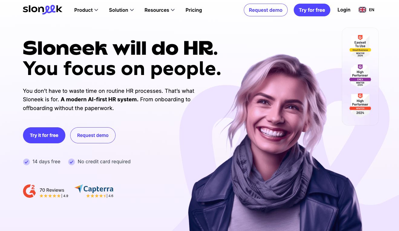
For example, SaaS brands do a splendid job of implementing this tactic. If you check out Sloneek, you’ll see it uses microcopy to emphasize that it offers a 14-day free trial and doesn’t require new customers to provide their credit card info.
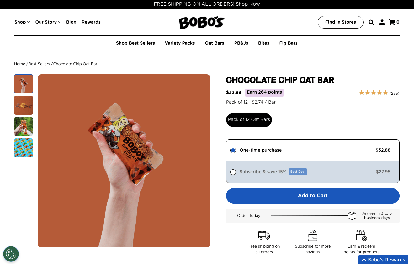
Or, you could do something similar to Bobo’s, a brand that understands all of its target audience’s primary conversion barriers. To encourage sales, this ecommerce business points out how long it takes for orders to arrive. It highlights the fact that all orders come with free shipping. Plus, it calls attention to its loyalty program, which rewards customers for every dollar they spend with the brand.
Prioritize Trust-Building Elements
A lack of brand trust can be a significant conversion barrier for your target audience. After all, Edelman’s latest research shows that 88% of people need to trust a business before being ready to buy its products.
With this in mind, you must use every opportunity to establish your organization’s credibility, communicate expertise, and demonstrate your dedication to customer satisfaction.
How to Achieve This
Fortunately, there are many methods of enriching your website with trust-elevating content.
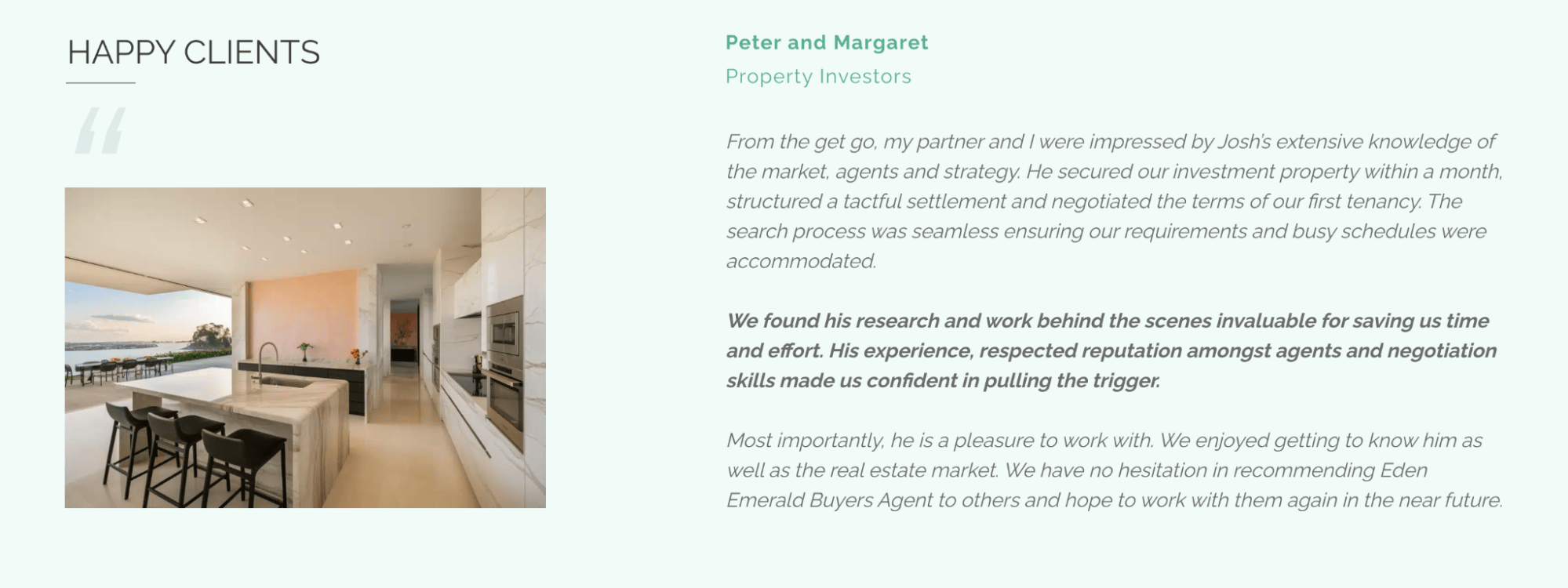
For starters, always do your best to present web visitors with relevant social proof and user-generated content. These are resources they will want to see before committing to a purchase, so positioning such elements in attention-grabbing spots — like Eden Emerald Buyers Agent did — can help you establish brand trust early on.
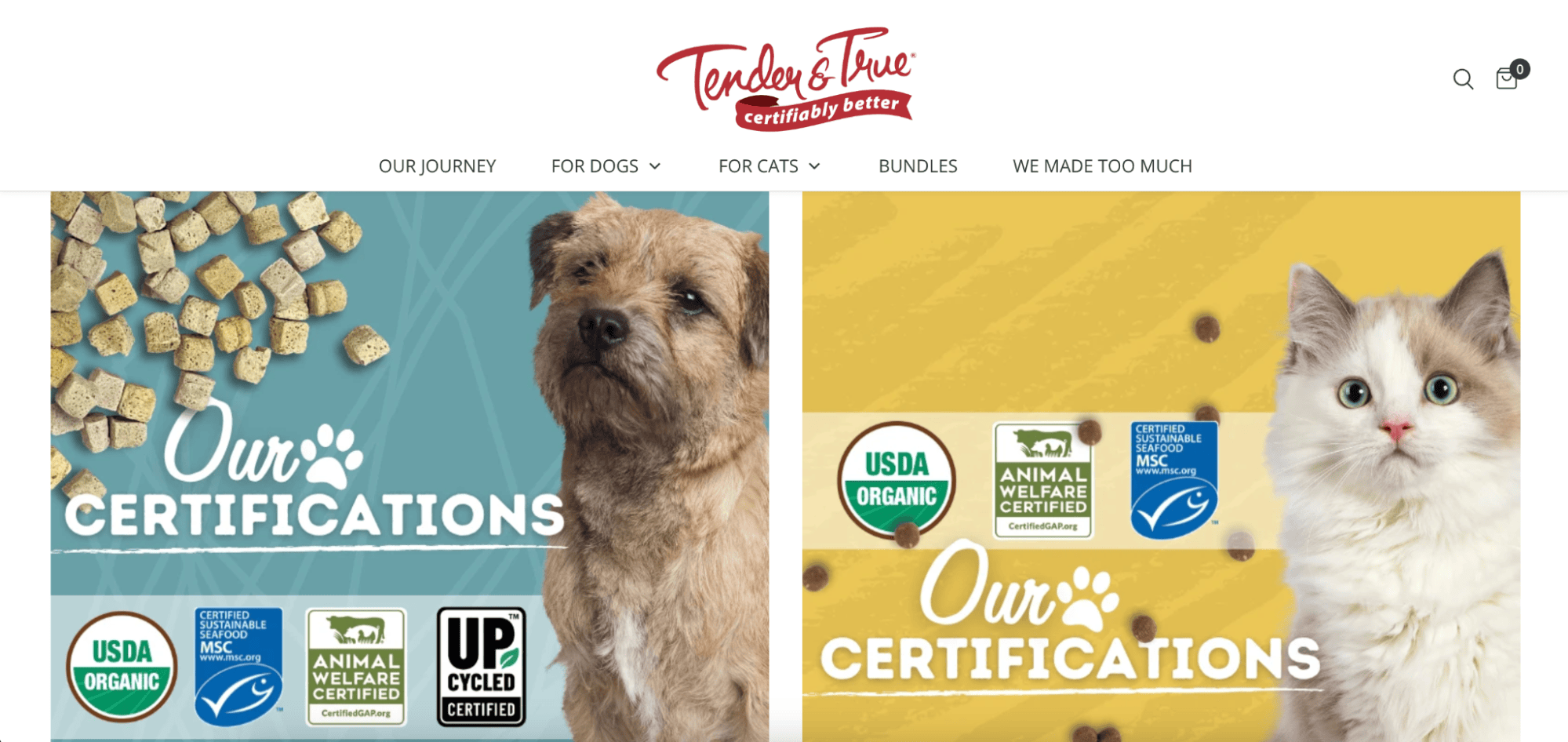
Secondly, explore ways to support your claims with trust badges or third-party certificates. Tender & True does this on its homepage, knowing its target audience genuinely cares about buying best-in-class food for their pets.
Ensure Web Visitors Understand Your USPs
For people to be willing to spend their hard-earned money on any solution, they first need to be convinced that it offers unique value. And the one prerequisite for this is, naturally, in-depth product understanding.
So, if you’re looking to encourage shoppers to take action and convert into customers, it’s important to go beyond just making impressive promises. It also may be worth dedicating some of your web design resources to elevating product understanding.
How to Achieve This
In general, there are two ways to ensure your web visitors comprehend your value propositions.
On the one hand, your website copy must contribute to product understanding via clarity, readability, and accessibility.
In simple terms, your USPs need to be straightforward. They shouldn’t use complex language that may alienate non-expert buyers. Finally, they should clearly state what buyers gain by investing in your offer.
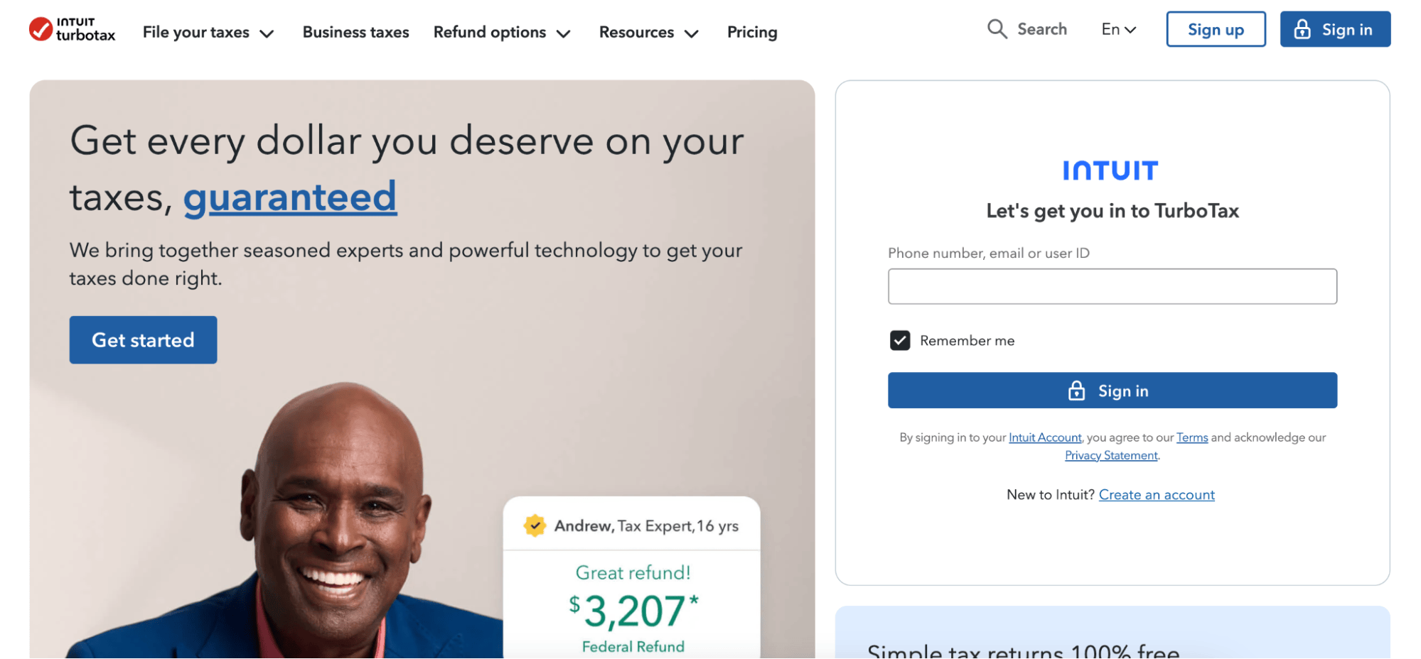
For instance, TurboTax does this beautifully by making a complicated subject — doing taxes and filing tax returns — seem as simple as using the right technology and hiring the right experts.
On the other hand, you might need to get into the nitty-gritty of how your products/services work — especially if you offer innovative or unique solutions your target audience might not have encountered before.
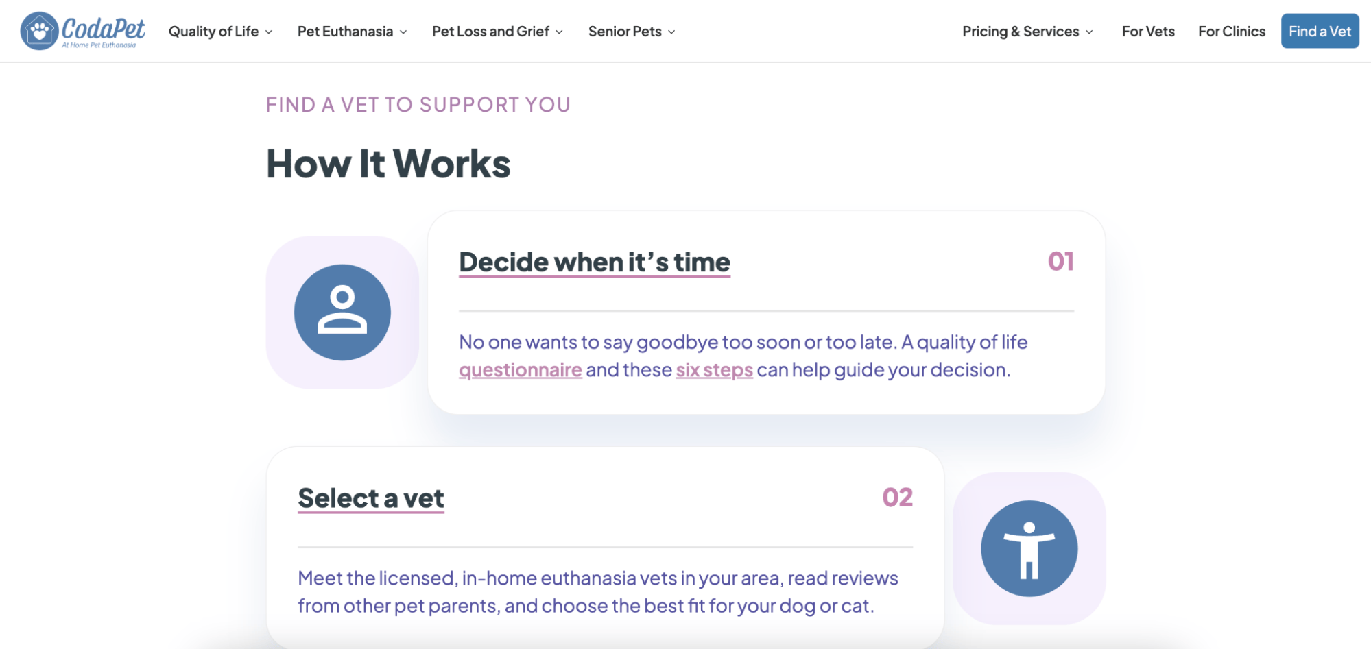
CodaPet, for instance, dedicates a significant portion of its homepage to a How It Works section. Here, the brand takes potential buyers through the process of finding and hiring a local euthanasia vet. It significantly elevates product understanding and automatically breaks down conversion barriers that hold customers back from buying.
Provide a Stellar Experience Even Before Inviting Prospects to Convert
Finally, as you explore tactics for encouraging shoppers to convert, use every opportunity to show they’ll get an unmatched experience by buying from your brand.
Ultimately, consumers demand enjoyable and personalized brand experiences. And they’re even willing to pay more if your business can provide them with a superior CX.
How to Achieve This
The great thing about this method of breaking down conversion barriers is that you can adapt it to your needs and budget.
For example, something as simple as elevating your site’s UX — specifically by making technical improvements to load speed and responsiveness — can be hugely helpful in showing your prospects they can rely on your brand to remove their pain points.
Or, you could dedicate some of your web content to promoting sought-after customer experience perks.
For instance, knowing that today’s consumers demand affordable (or better yet, free) shipping, simple checkout processes, and convenience options like subscriptions, advertising these perks can be a marvelous way to encourage web visitors to convert.
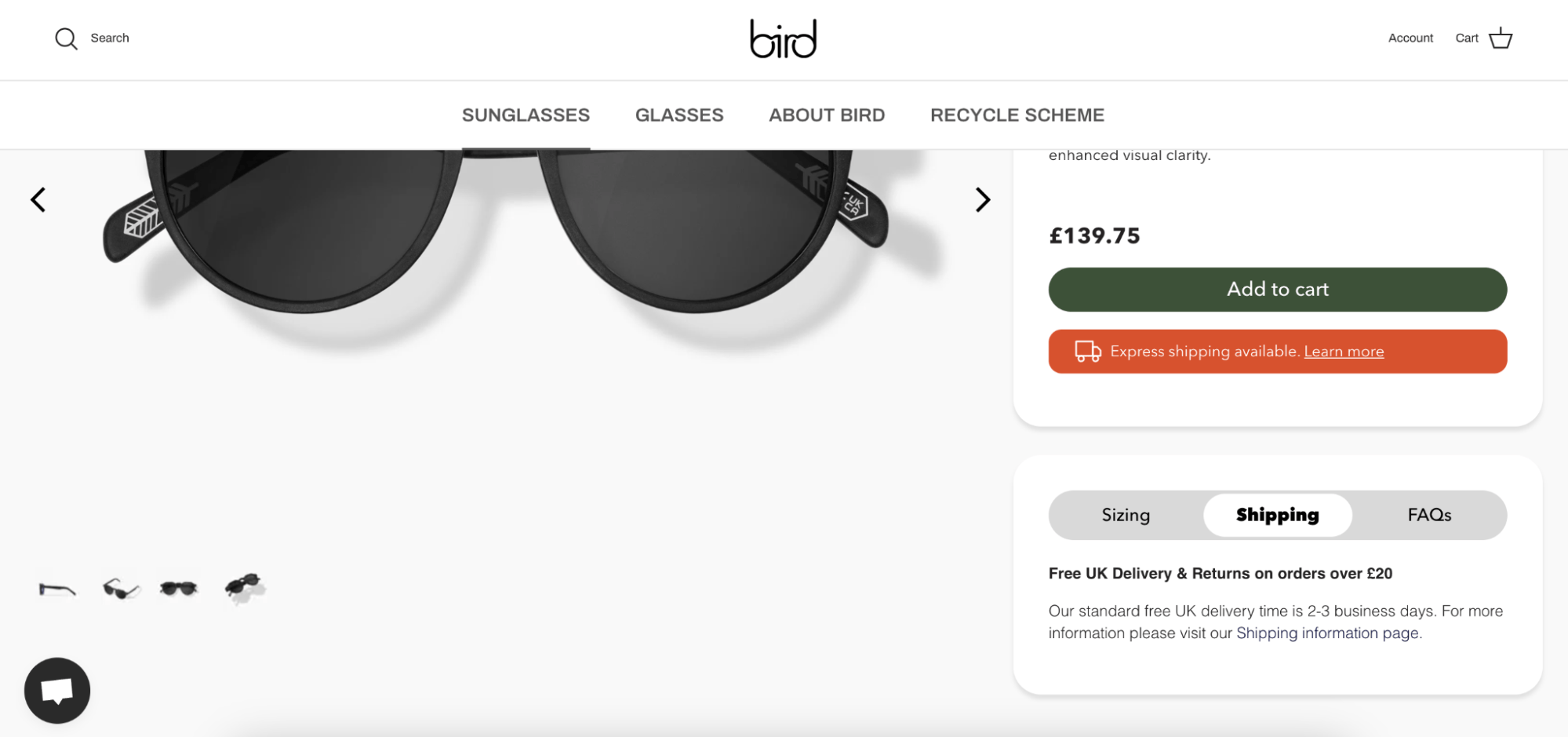
This is what Bird does on its product and cart pages, calling its prospects’ attention to the fact that purchasing its products is fast, convenient, and secure.
You might also be able to do this with content.
Articles, videos, and other resources that help your prospects identify and (more importantly) solve their pain points can be a great method of demonstrating your brand’s dedication to customer satisfaction — both during the pre and post-purchase phases of the buyer’s journey.
Investing in this type of content can be an amazing way to break down conversion barriers. It can also serve as a method of differentiating your brand and even a way to reach and attract awareness-stage consumers whose top purchase priorities include high-quality customer support.
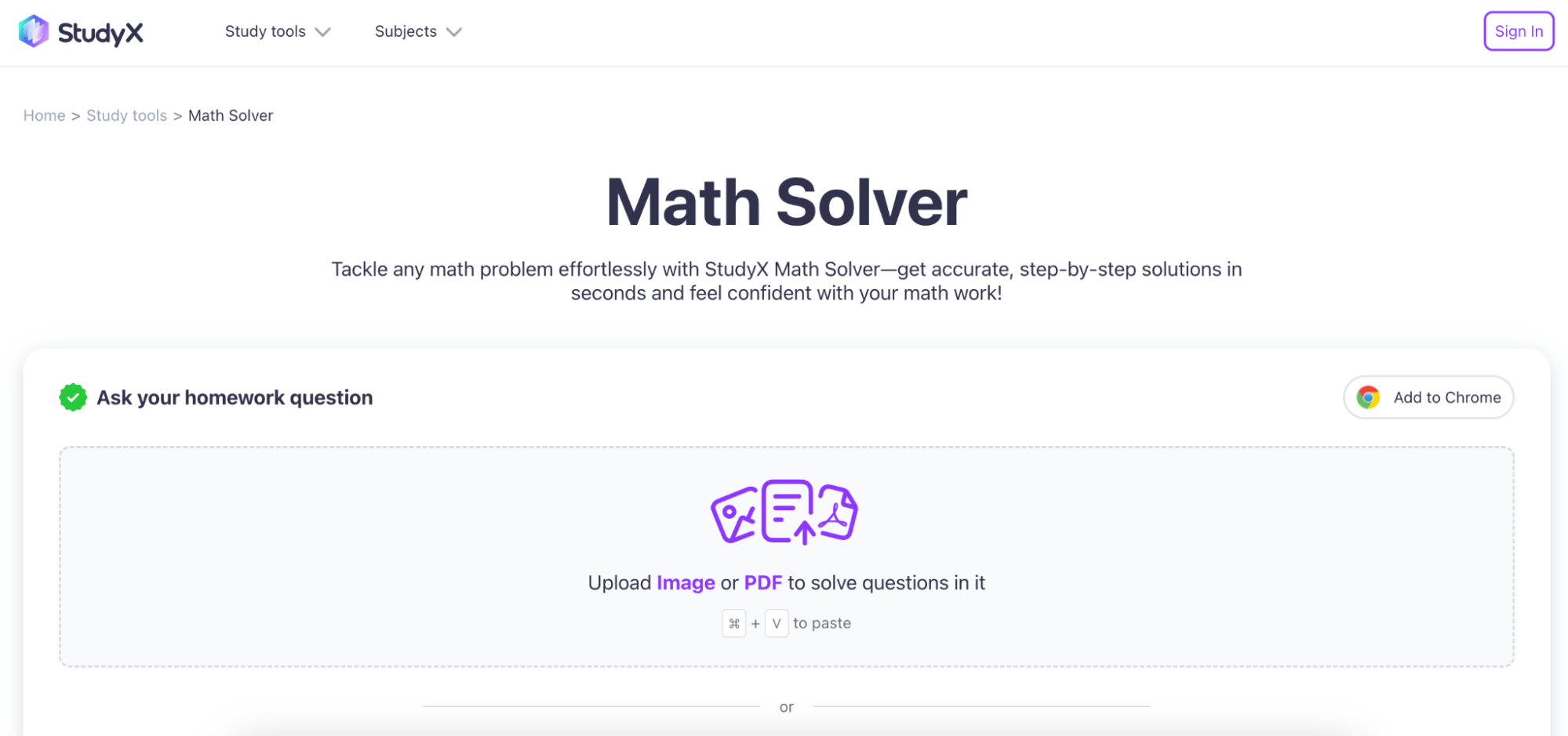
Finally, remember that free tools — like the StudyX Math Solver — present a great method for helping your prospects understand the value you offer, attracting them into the sales funnel with the promise of zero-risk returns and an incentive to continue engaging with your business.
This applet, in particular, is a great example of how your brand can use interactive content to establish its solutions as effective and turn them into an irreplaceable part of your target audience’s lives.
Final Thoughts
Breaking down conversion barriers calls for a strong understanding of your target audience. Along with their wants, needs, and aspirations, it’s also essential that you comprehend their fears and frustrations.
Then, by addressing and removing these fears, you can reassure web visitors that they can trust your business to keep their best interests at heart. Moreover, you can establish your brand’s authority, credibility, and expertise and effectively position your solutions as the best way for your target audience to solve their pain points.