
As the end of another year approaches, we all slowly but steadily train our gaze on the year to come. And since 2020 has been quite an unprecedented year, at this point, we can only venture a guess as to what 2021 has in store.
However, we certainly won’t be taking a shot in the dark if we claim that online shopping will remain a rising trend, and that ecommerce will continue to see some palpable growth. We can also safely assume that we will still be spending a lot of our time online, engaging with familiar and new brands across different platforms.
All of these facts go to prove that now is a great time to take a look at your landing pages and see what you can do to improve them further.
In this post, we will be looking at a very important aspect of landing page design: call-to-action buttons. Everybody has them, but not everyone uses them to their fullest potential.
Let’s dive right in.
What Is a CTA Button?
Just in case you are not completely comfortable with the term, let’s briefly clarify what CTAs are.
A call-to-action is a bit of text (that can also be combined with an image or take on the shape of an actual button) that tells your visitor what they should be doing next. This can be signing up for your email list, making a purchase, checking out some of your content – any action that you want them to take and that is of a certain value to you.
What Makes a Good CTA?
Unfortunately, there is no clear answer to this one.
A CTA that works well for one brand won’t do anything for another, and vice-versa.
Your main aim is to:
- Attract attention
- Establish a connection
- Build trust
- Spark interest
- Inspire action
The key to designing CTAs that convert is knowing your target audience and the pain points they are trying to solve.
The better you understand them, the more effective your CTAs can be.
Now let’s take a look at some more hands-on tips and examples.
1. Use More Than One CTA
There will be pages where a single CTA works well – for example, your blog posts can feature a single CTA button at the bottom. However, your sales-focused landing pages would benefit most from featuring more of them.
How much is enough will depend on the length of your page. Essentially, try to aim for having a CTA within reach no matter where a visitor is located on the page.
You want to be careful not to go overboard. Too many CTAs will often come off as pushy and too sales-y, so you want a nice middle ground. Working out what that middle ground actually is might take some time, but the effort will be worth it.
Another point to bear in mind is keeping your CTAs cohesive. You don’t want each different page to use completely different CTA copy and design. It will only cause confusion.
You can craft different CTAs for different purposes and use one kind of design for email signups, another for conversions, a third one for your informative CTAs, and so on.
2. Place Your Most Valuable CTA First
This is where another issue arises. Which CTA should you place at the top, and how should you determine which ones to scatter throughout the rest of the page?
When we consider what a CTA is – a way for you to inspire action – the best way to make your choice is to consider two things:
- Who is going to be landing on that particular page?
- What is your most valuable conversion for that audience segment?
For instance, if you have a page that is specifically designed to be a lead magnet, your most valuable CTA will be the one that inspires people to sign up for your email list. On the other hand, a sales page (or your homepage) might benefit from a more sales-specific CTA.
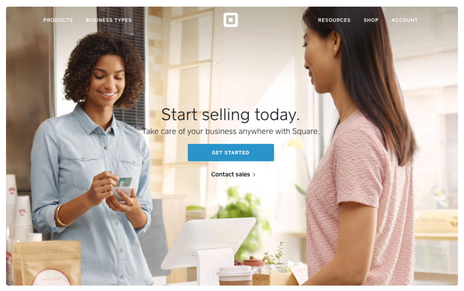
However, the latter doesn’t mean that you need to offer an outright sale. Shakr offers a demo signup in their hero section – that’s definitely an action that is meant to lead to a conversion, but not an outright purchasing or committing CTA.

3. Choose a Stand-Out Color
As you want your CTAs to be noticeable, the easiest way to achieve this is to use vibrant, contrasting, and eye-catching colors. Depending on your page’s design, a color opposite to it on the color wheel can work well.
You don’t want the effect to be garish and overwhelming, though. You’re aiming for something effective but not over the top.
Here’s an example from Medical Alert Buyers Guide, whose CTAs are orange.
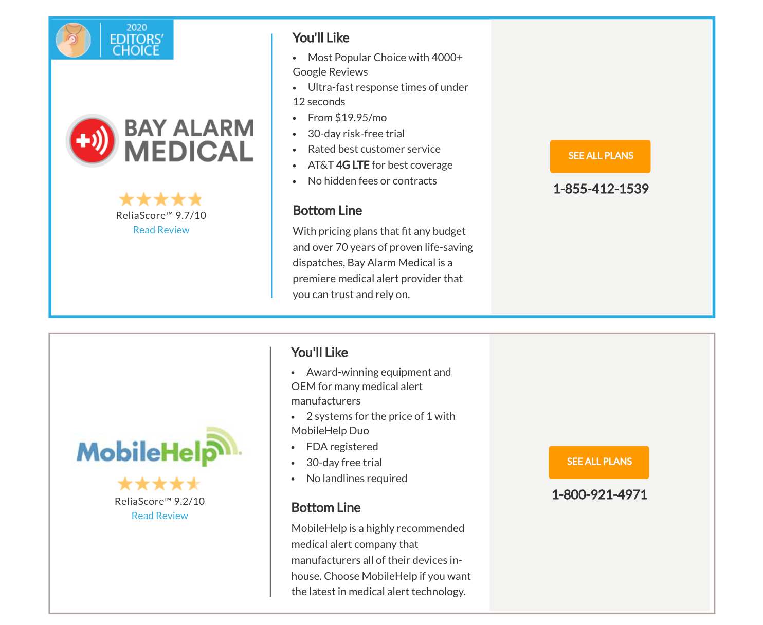
Definitely a very colorful option, but it works well on the page, especially as it’s the most visually attractive part. It’s not too overpowering, though, as the CTAs are not too big.
4. Blend It In
If you don’t like the idea of a very colorful CTA, you can do the exact opposite and create CTAs that blend in with the rest of the page. This will certainly be the better option if you’re looking for visual cohesion and aiming for a neutral, serene effect.
Don’t worry about visitors not being able to spot your CTA – they will still be noticeable, just not as wildly so.
Somnifix has achieved this effect very nicely.
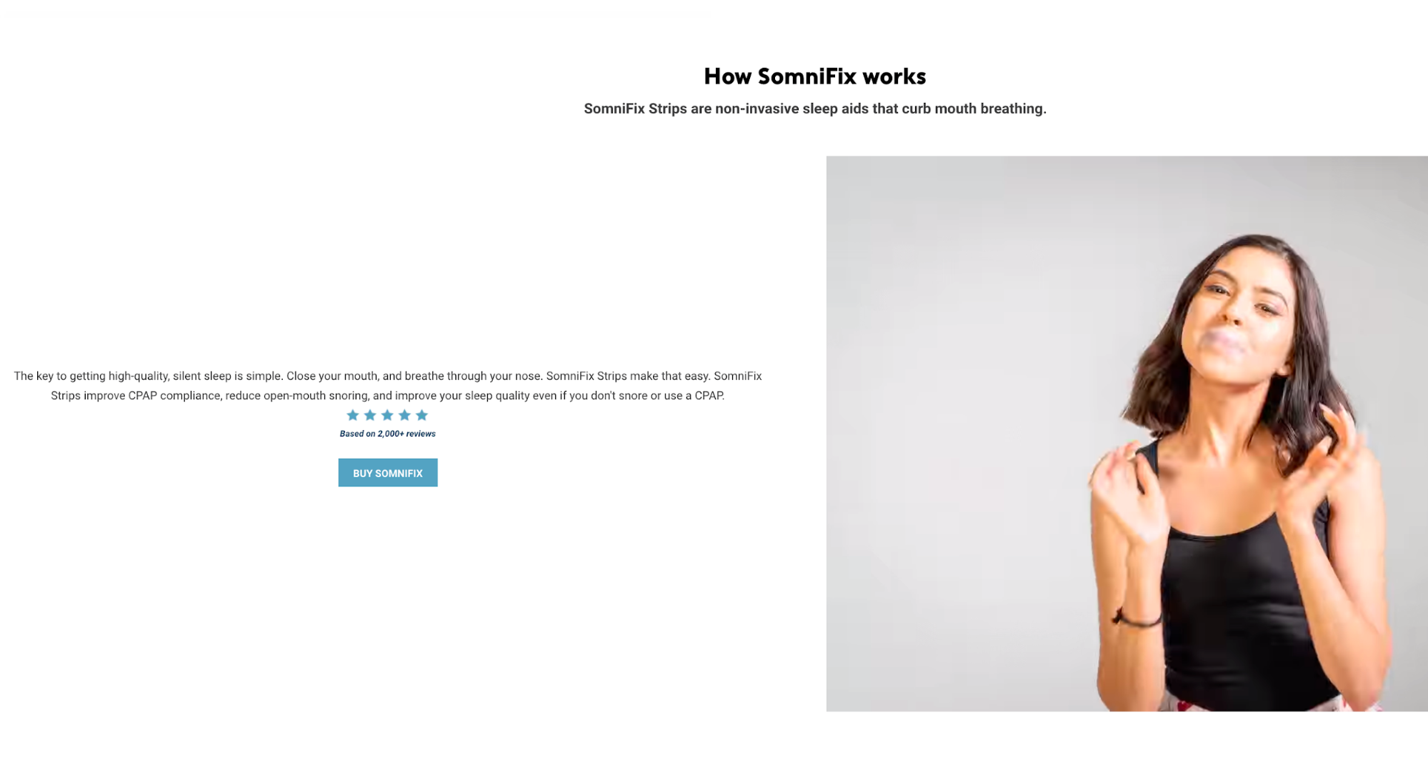
Considering that their product promotes healthier sleep, it’s no wonder they have chosen the more muted route, which is much more in line with their branding. Sticking an orange CTA on their page would have achieved an adverse effect.
5. Keep It Branded
Branding your CTAs is a great way to improve brand identity. You won’t be able to do this with every single CTA, but there are instances where it can be achieved without making it sound unnatural. As you’re trying to deepen the connection a visitor has with your brand, insisting on the community aspect of the service or product, with the aid of your CTA, is the way to go.
You can go for Join BRAND NAME today, or Try PRODUCT NAME – simple but effective, and it underlines brand identity.
Prezi has branded their different solutions: Prezi Present, Prezi Video, and Prezi Design. Nothing over the top, but a simple yet effective way to reinforce a connection with the brand.
6. Focus on Your Main Assets
Sometimes, you want the CTA to convey your biggest selling point as concisely as possible. That’s especially the case when this selling point is something super-effective, such as a free trial, a money-back guarantee, free delivery, and so on.
Adding this CTA to the hero section of your page can be incredibly effective because you’ll be grabbing the visitor’s attention instantly with something that points to a quick and easy conversion.
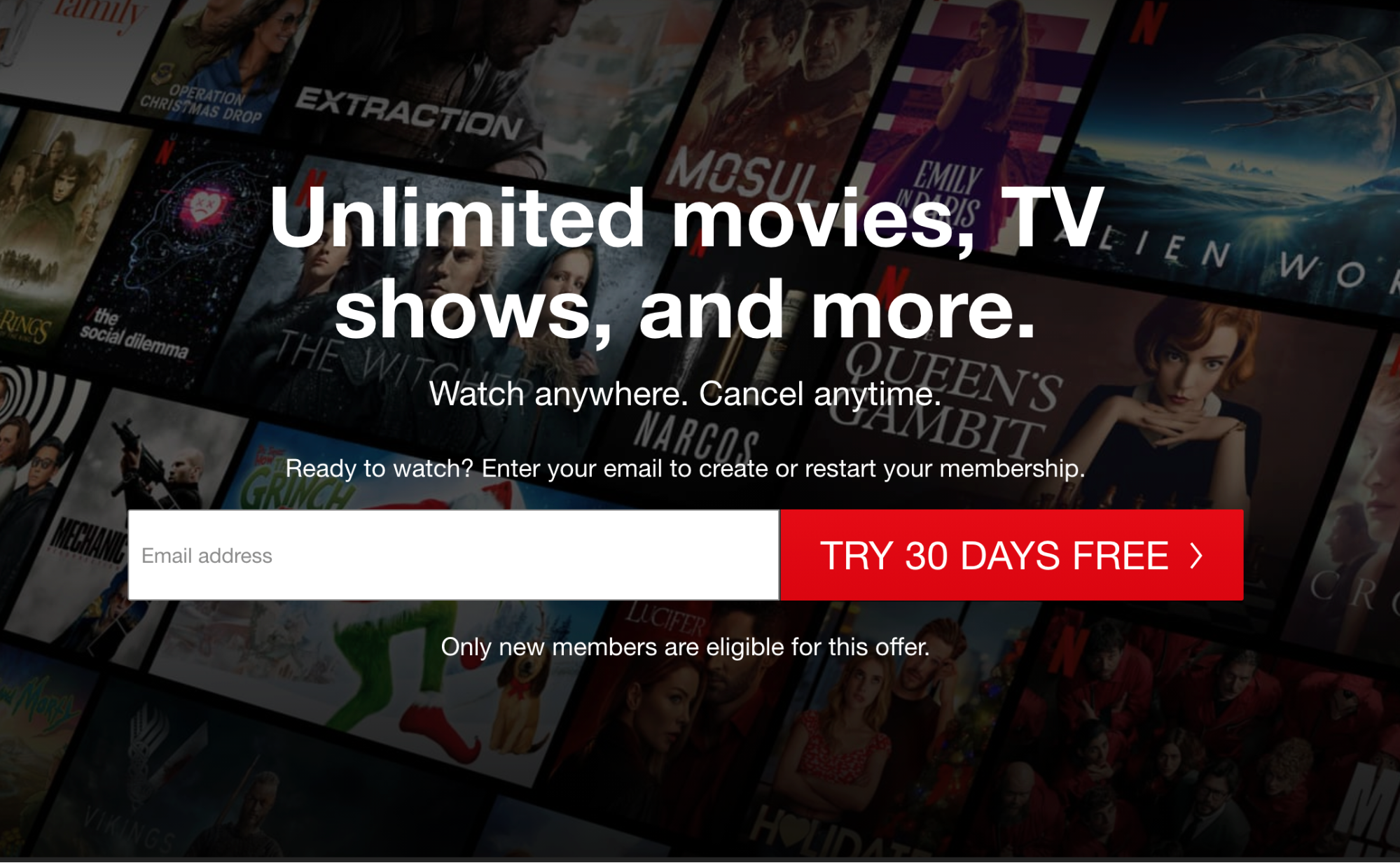
A brand that does this well is, of course, Netflix, with their 30-day free trial highlighted right at the top of the page. Since anyone landing on the homepage will likely already know what Netflix is, offering this instant conversion path saves plenty of time and scrolling.
7. Don’t Limit Your Choices
Homepage CTAs can be tricky, and brands often stick to the simplest solution – offering an email signup or redirecting traffic to their sales pages. That’s understandable, especially if you sell more than one product, offer more than one service, and target more than one audience segment.
While you can certainly circumvent the confusion by designing different landing pages for different audiences, you still need a homepage. And it needs to cater to a large part of your visitor base.
BarkBox, for example, has come up with a clever solution – they offer the option of signing up for their service or sending a gift to someone else. This solution works with their two largest audience segments, and it offers an instant way to convert from the homepage.
8. Offer More Information
Another great way to approach CTAs is to consider them as a way to provide extra information.
This approach will be useful for situations when a lead is not quite ready to commit to a conversion just yet. Maybe they want to learn a bit more and would like to be taken to a page that details more of your solution’s features, discusses pricing in-depth, or provides testimonials from other clients.
This kind of CTA can work especially well if you provide a service or sell a product your customers are not 100% familiar with. They will appreciate you trying to provide information, as opposed to forcing a sale on them.
WP Engine provides these kinds of CTAs within their hero section. Their entire homepage features zero sales-focused CTAs and focuses purely on bringing their solution closer to their audience.

Considering how complex hosting can be for the uninitiated, this kind of solution will work wonders.
9. Stick to Simplicity
Sometimes the best CTA is one that does not demand too much of anything. No attractive colors, no creative copy, no bells and whistles, just a simple prompt to perform a certain action.
This is especially true when it’s quite clear to a visitor what they should be doing, and they just need to be provided with a way to do it, without any additional coercion.
Runner’s Athletics has these kinds of CTAs that are essentially nothing more than Add to Cart buttons. Yet, that’s all they need. They have showcased their products, so all that’s left for a visitor to do now is make a purchase – and that action can be inspired with a very straightforward CTA.
10. Use Compelling CTA Copy
A CTA that converts is not just about appearances. It’s often about the way you choose to phrase your copy.
While the simplest and fastest solution would certainly be to go for one of the well-known versions of the “sign up” and “click here” variety, a little bit of effort on your part can make all the difference.
This is where you should truly be considering both your target audience and your brand identity. What is it you can offer customers, what makes you unique, what is your story?
Suntrust features a great CTA in their hero. As the company tries to tackle the unique challenge of helping you grasp your finances better, the hero CTA doesn’t take you directly to a sales page.
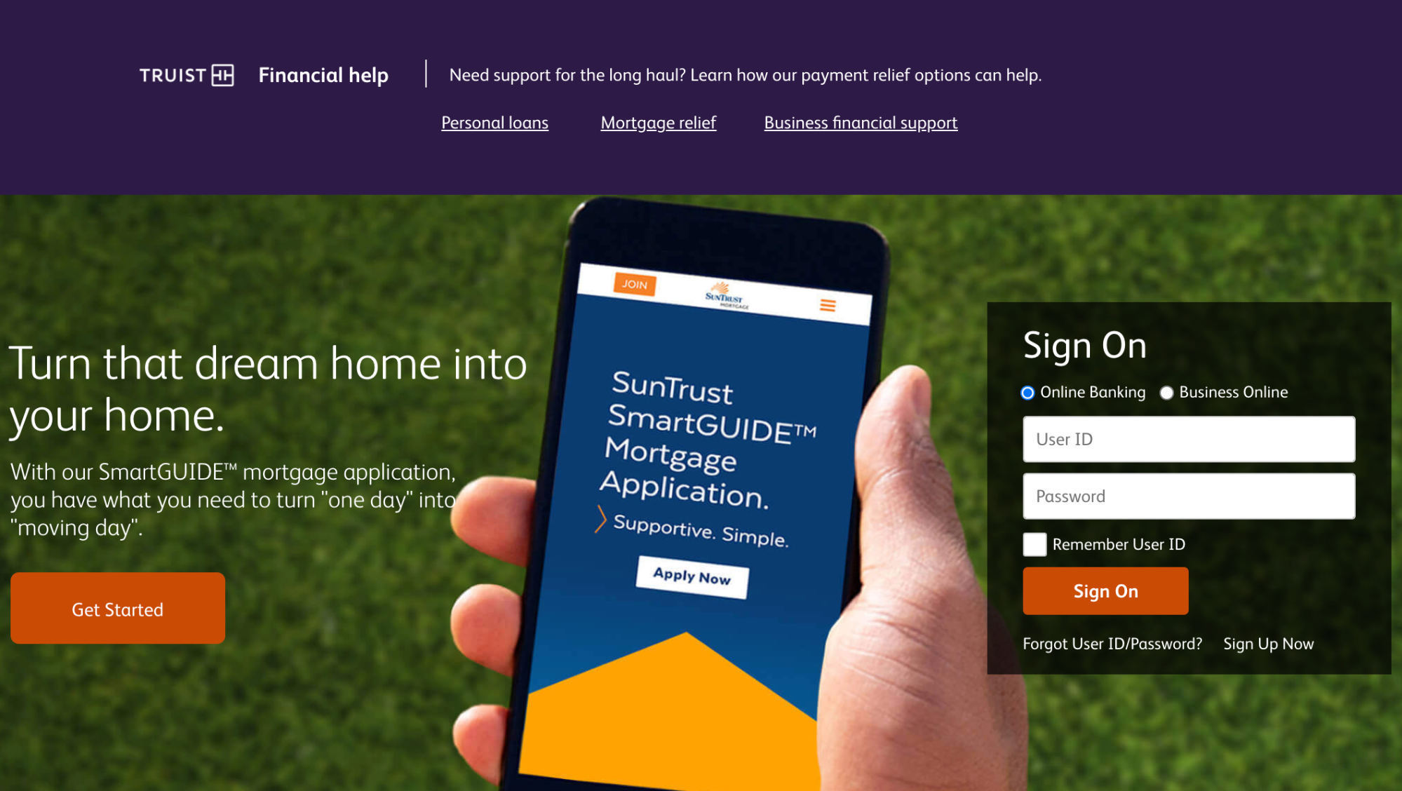
The copy used is appropriate and definitely not your run-of-the-mill CTA solution.
11. Don’t Forget about the Background
Focusing on the copy and the design of the button itself shouldn’t overshadow your considerations about the background you want to use with the CTA.
Some might work well with a plain white background, but others will need hero backgrounds or images that add some visual value to your page without distracting too much from the CTA itself.
Take some time to consider the background when designing your CTA. You might find you need to make it white instead of black, or that you need to make it slightly larger than you originally thought.
Sleep Junkie has done a good job of aligning their CTAs with the background they are featured on, adapting their color and size accordingly. For example, the homepage features a purple colored button that stands out and matches the other design elements on the page.

12. Focus on the Solution and the Benefit
One of the basic rules of sales is “sell solutions, not features.”
You should always be focusing your sales copy on your customers and what they are getting, as opposed to yourself and the amount of work you’ve poured into a product/service or what that product/service can do.
You want to make it clear what converting will provide and how it can benefit your visitor. Show them what they can expect to receive and how that will slot into their life. Let them know how it will make their life easier, happier, more organized, or whatever other benefits your solution can offer.
Achieving all of this with a CTA can be quite a challenge, but it can be done. Take a look at Body Alchemy’s CTA. It might be a bit long, but it is definitely unique, and it cuts right to the chase, clearly stating what the visitor will gain by clicking on that button.
13. Focus on Instant Gratification
Today’s online consumers are used to, and addicted to, instant gratification.
When we consider how much instant access the internet actually provides, it truly is no wonder we have become a species that has the attention span of a goldfish.
What this means for your CTAs is simple: you can boost your conversion rates significantly by pointing out how the action you want someone to take can lead to instant gratification.
For instance, if signing up for your email list provides instant access to an ebook, make sure you emphasize this in the CTA. If making a purchase can help someone instantly access or unlock a certain benefit, point that out.
Making people feel they’re getting something right away is a great way to compose your CTAs, especially if there is a bit of FOMO involved as well.
Shopify knows this well, so their Academy CTAs play with instant gratification by highlighting all the features you are gaining access to just by signing up.

Not to mention, their resources are actually very useful, which makes it even more worth the visitor’s while.
Don’t Forget to Test Them out
Hopefully, all of these examples have inspired you to take a look at your existing CTAs and consider different ways to make them appeal to your audience. But before we part ways, we must discuss another very important aspect of CTA design – A/B testing.
A/B tests sound a lot more daunting than they actually are. Their sole purpose is to determine which out of two possible solutions works better for your page.
The key to successful A/B tests is only ever testing one aspect of your CTA at a time. You start out with your current CTA (or a brand new one you’ve designed) and use that as one landing page. Then you change only one aspect of it (copy, color, emotion, etc.) and compare that page to the original one.
You can do this indefinitely, or at least until you come up with a combination of copy, design, and placement that works best for your pages.
Don’t make more than one change at a time. If you do, you won’t be able to measure effectiveness correctly, as you won’t know which of the changes influenced one CTA to perform better than the other.
Final Thoughts
Now that you are aware of the importance of your CTAs, you can take a bit of time to analyze the ones you are currently using and come up with new solutions.
Keep both your target audience and your brand identity in mind when thinking about new design and copy, and the solutions you come up with should be worth your while.