According to a 2019 Spiceworks survey, 80% of businesses use at least one SaaS app in their daily operations. What’s more, an increasing number of companies are expected to run entirely from the public cloud in the near future.
For SaaS business owners, this is excellent news. However, with increased demand comes a rise in competition, which means that every single one of their marketing channels needs to be fully optimized.
When it comes to landing pages, they’re one of the most valuable marketing assets a company can invest in. As a destination for directing both organic and paid traffic, they can be used for promotion and lead generation. And thanks to analytics software, you can precisely measure their effectiveness, making any necessary changes to optimize performance.
But, if you’re unhappy with the conversion rates on your SaaS landing pages, it might be confusing as to where to start improvements.
The following are tips on actions you can take to design a highly converting SaaS landing page, which will bring in way more than the average 2%.
Buyer Journey Tailoring
Sending all your potential clients to the same landing page isn’t, well, the best use of your money or time. Sure, it’s way better than linking to your homepage, but one size does not fit all, especially in the SaaS world.
So, before you go about designing your landing pages, you must have a strong understanding of your potential customers’ needs.
Asking the following questions could help you design highly converting SaaS landing pages:
- Who is your target audience?
- What type of product do they need?
- How does your product meet their requirements?
- What makes your software different from competing brands?
- What makes your services unique?
- Is there an ideal way to communicate your products’ benefits?
Most importantly, you need to know their approximate position in the sales funnel.
A person who is still in the awareness phase (i.e., knows they have a need but hasn’t decided on a solution yet) is likely to respond to a different type of landing page than someone who’s close to buying and is after technical details.
For an example of how landing pages differ based on the buyer journey, take a look at these two landing pages from Spotify.
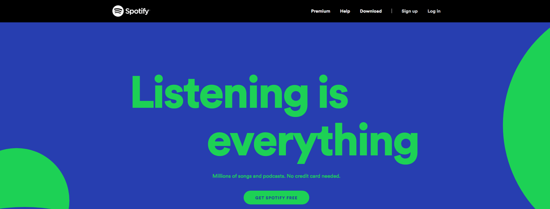
The first screenshot shows a page designed to appeal to people who have never used the streaming service before. The unique value proposition is “Millions of songs and podcasts. No credit card needed.” Here, the aim is to get as many people as possible to sign up for the free service.
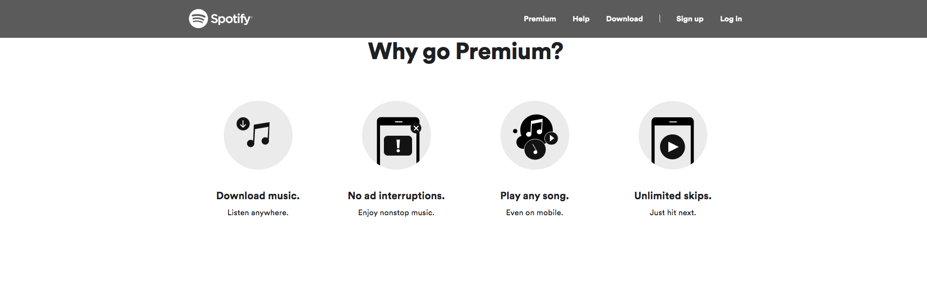
The second example, however, is a landing page made for users who already have an account but still haven’t subscribed to the premium service. For them, the main points of interest will be features like the ability to download music, no ads, mobile listening, and unlimited skips.
Header Section
According to a 2018 Nielsen eye-tracking study, web users spent 57% of their page-viewing time looking at elements above the page fold. With this in mind, it becomes clear that a highly converting landing page needs to engage audiences right from the top. And that means a well-designed header image, headline, and call to action. Keep in mind that all these are possible only if you pay attention to how to hire a graphic designer to find high-caliber specialists who will help you succeed.
There’s advice going around that, if you’re after conversions, you want to use images of people in your hero section. And while the approach could prove to work, you need to understand that landing page conversions cannot rest on copy-paste marketing methods.
So, instead of going for hero section visuals because they’re “supposed” to convert, why not start the design process by looking for elements that will be effective at communicating your unique value proposition?
If you do decide to go with images, the best word of advice would be to use original visuals, which reflect your company’s values. However, you can also go with animation, illustrations, or even a simple colored background.
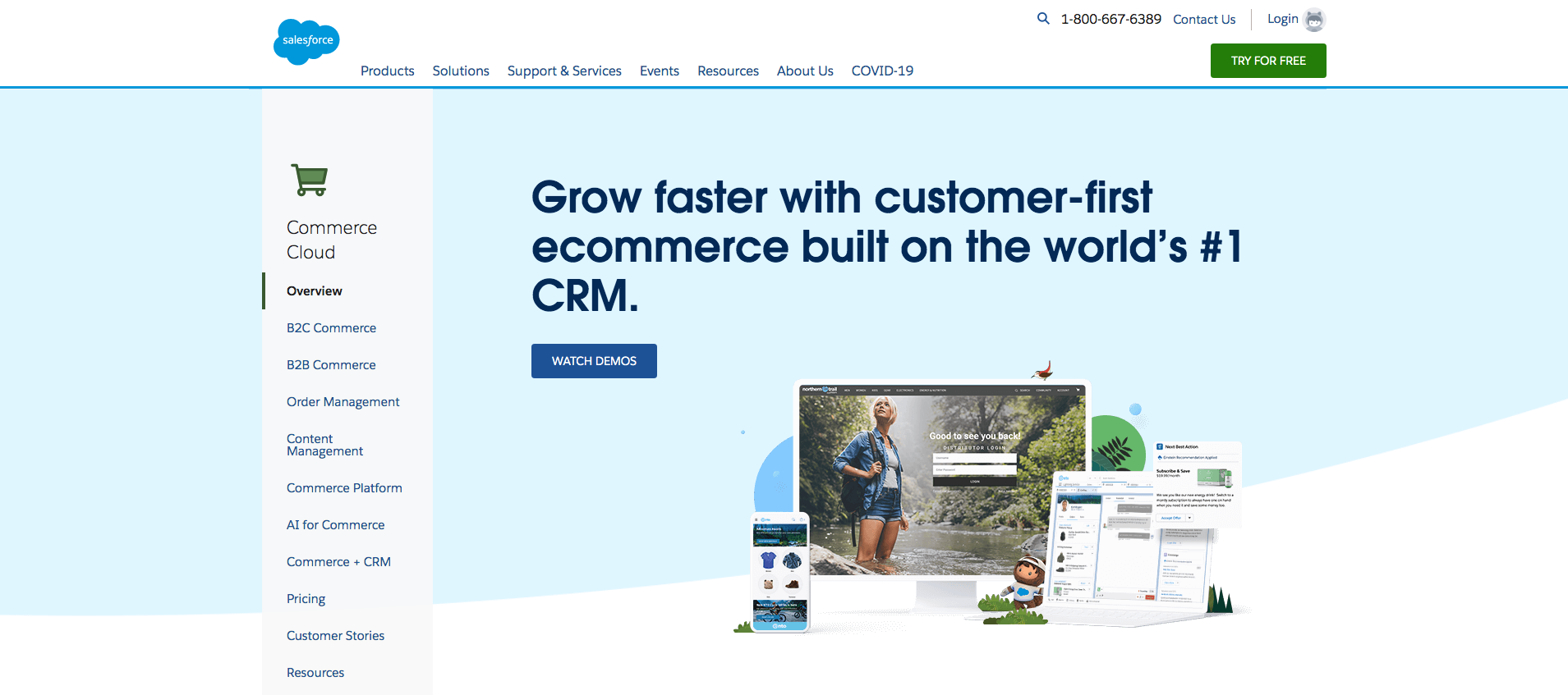
For example, if you take a look at the Salesforce Commerce landing page, you’ll see that it uses a neutral background color to allow the headline to pop, combined with illustrations and in-app screenshots.
ZenMaid, on the other hand, goes with a slightly more conventional approach in terms of visual elements. This SaaS company decided to deliver its wow effect via a changing headline that addresses several different user problems.
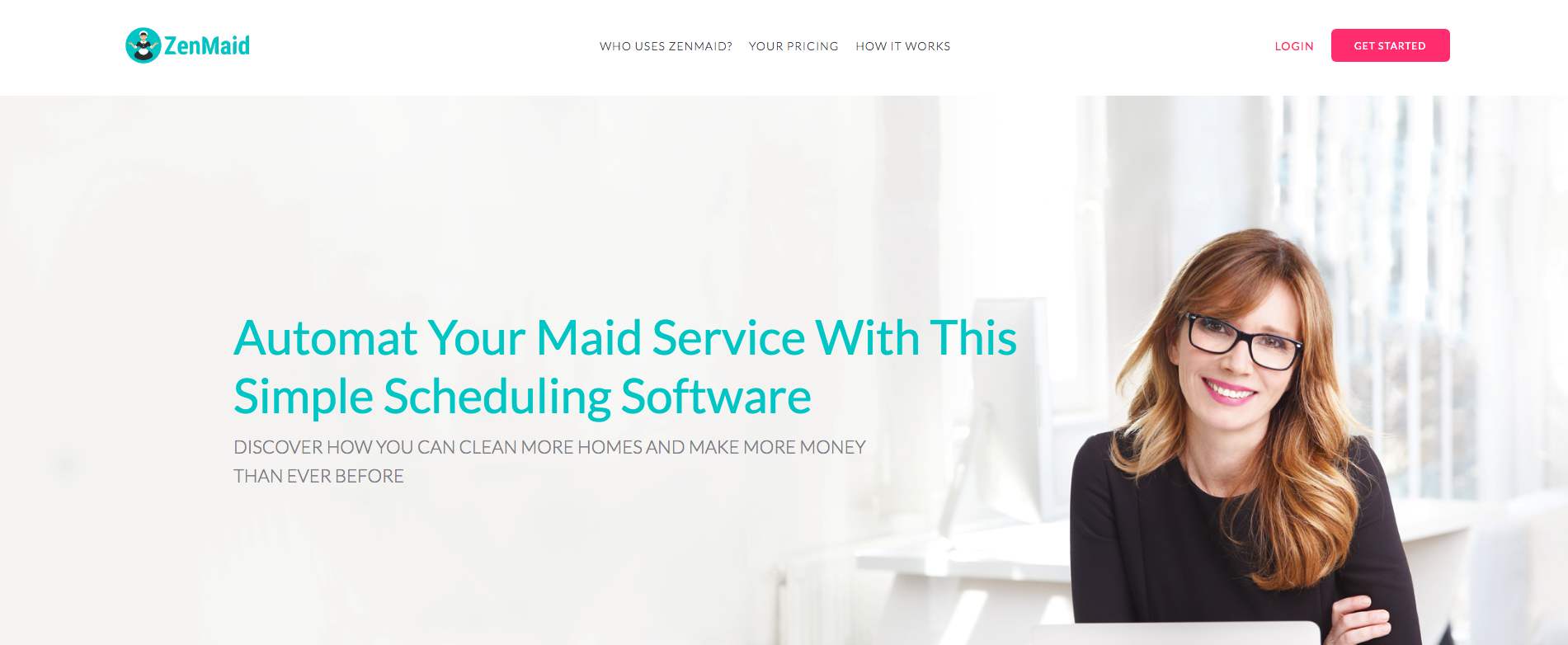
Neither of the two approaches can be labeled as better. Both offer certain advantages. But, when choosing header visuals for your SaaS brand, you need to consider the type of approach that will resonate with your audience the best. If you’re unsure, that’s no problem. You can run an A/B testing campaign and measure results.
As for CTA buttons, both mentioned brands add it to the top right corner of the landing page, choosing a contrasting color and a couple of short, action-oriented words. This element of the companies’ landing pages shows room for improvement, particularly as a more central position may encourage higher conversions.
Benefits vs. Features
Selling physical products with ecommerce may be more challenging than doing it in-store, but it’s still relatively doable with an old-school approach. For SaaS, however, you’ll need to bring your A-game.
When looking for a software solution to invest in, most people don’t want to read about the features or technical specifications. They want to know how they’ll benefit from the investment.
For example, think about purchasing a digital asset management software solution, like this one by Filecamp.
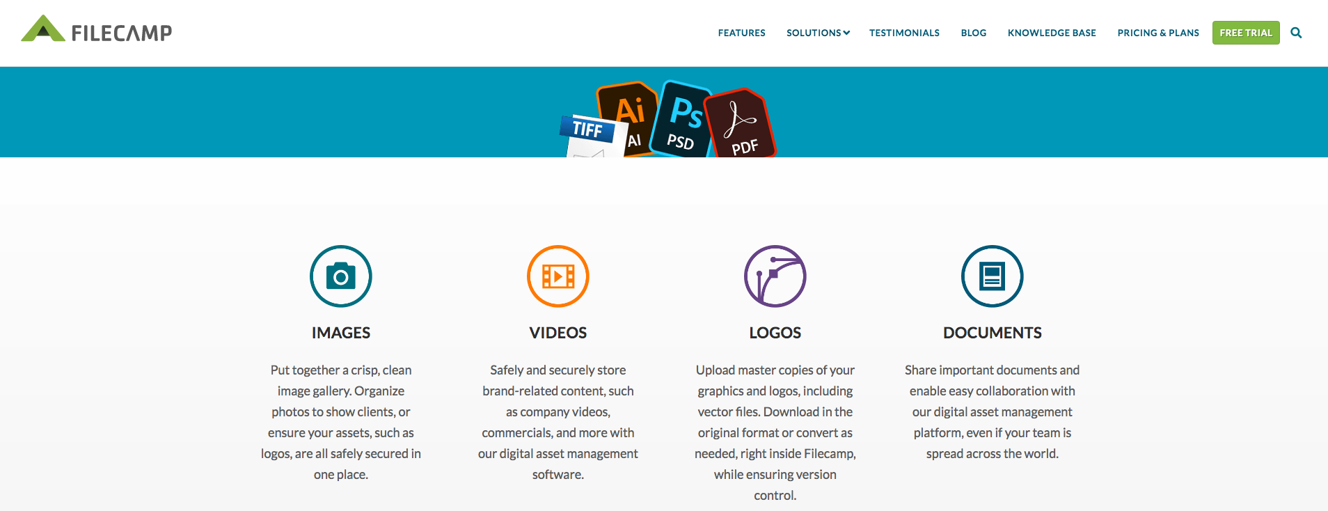
Instead of listing all the features on the landing page, this brand chose to take a user-centric approach and show how the software could benefit business owners.
So, file format support isn’t listed as .ai or .jpeg compatible. Instead, there is an entire section dedicated to file compatibility, addressing users’ need to store images, videos, logos, and documents on the same platform.
Social Proof
There’s not much need going into how good social proof is at driving conversions.
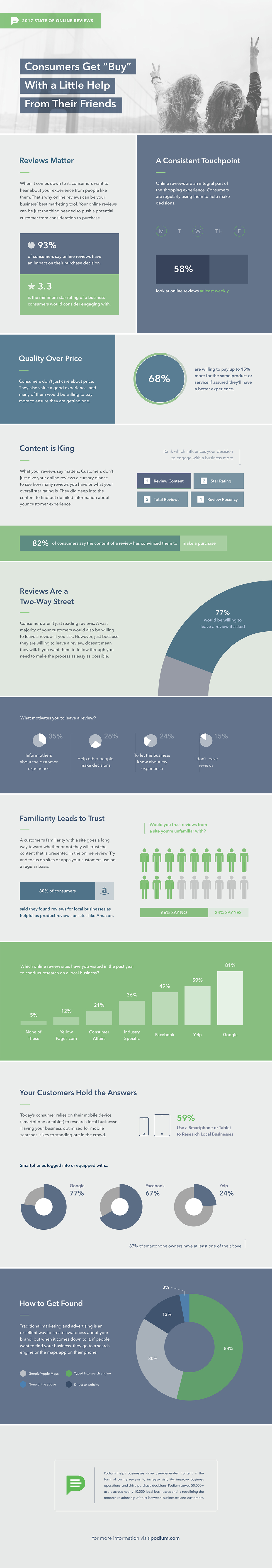
If you take a look at the statistics, you’ll find that as many as 93% of consumers think of online reviews as relevant information when making purchasing decisions. Even more, testimonials on sales pages boost conversions by as much as 34%, and that’s for “sober” reviews.
With this in mind, it comes as no surprise that highly converting SaaS landing pages definitely should include a testimonials section.
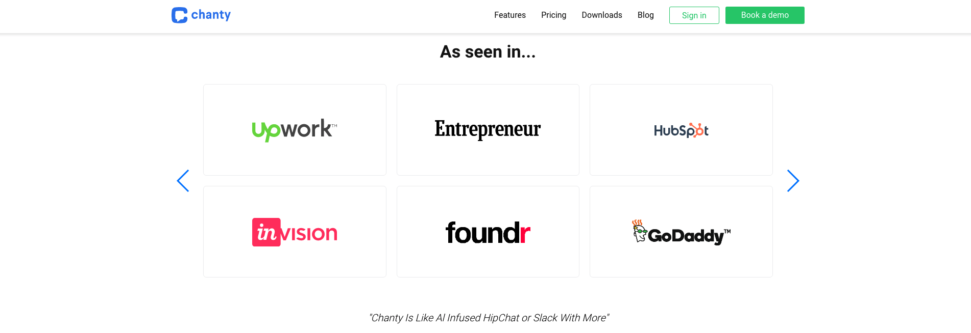
Now, there are several ways to go about this. For some, showcasing media coverage is going to yield the best results. That’s what Chanty does with their “As seen in” section, linking to articles on authority websites like UpWork and Entrepreneur.
However, you can also go a different route and let your customers speak for you. You can do this by adding a section on your site that shows off testimonials or third-party reviews from popular sites like Capterra or G2.
FAQ & Customer Support
If you examine consumer behavior (and human behavior in general), you’ll notice that buyers aren’t exactly the most patient of creatures.
Research dating back to 2013 suggests that as many as 65% of consumers expect brands to reply to their inquiries within two hours. And things have gotten only more complicated since almost a decade ago.
Brands who want to stand out from the competition don’t just have to provide the best product and price. They also need to offer stellar support that goes beyond expectations.
A common mistake businesses make on their landing pages is that they advertise benefits like 24/7 support without actually backing up the claim.
To minimize bounces on your SaaS landing pages, you want to ensure stellar on-page support. Of course, not all businesses can afford a 24/7 customer service team, which is why you need to look for more budget-friendly solutions. Chatbots are definitely one of those. However, what many people forget about is the old fashioned FAQ section.
Keeping an eye on incoming customer inquiries, you can put together a landing page section that addresses commonly asked questions. You can offer support through other forms of interactive content as well.
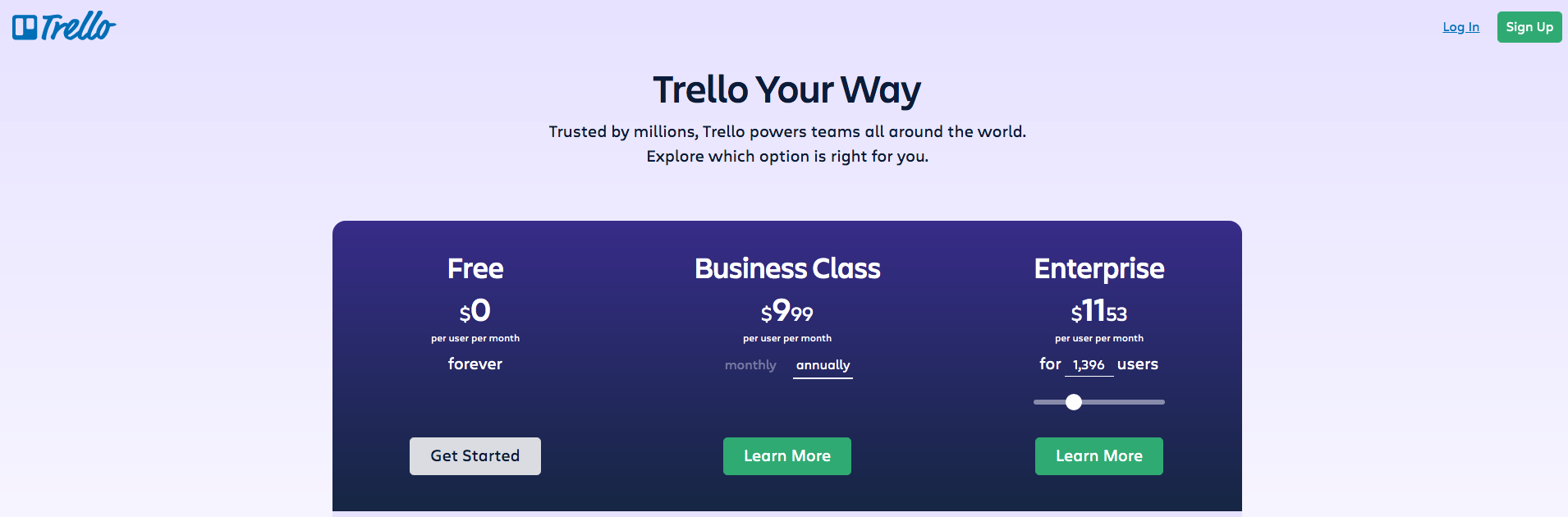
Trello has a unique way of helping customers choose the right plan. On their pricing landing page, the Enterprise section offers a handy slider feature, allowing potential clients an insight into how much the SaaS solution would cost for the size of their team.
It’s a simple yet effective solution, ensuring that anyone interested has immediate return information.
How-to and Explainer Videos
If you look at consumer behavior, you’ll find that most purchasing decisions require either low-involvement or high-involvement decision-making.
Purchases that require low-involvement include impulse buys or those that don’t come with high levels of risk. Investing in SaaS software, however, certainly falls into the second category. Here, buyers need to make informed decisions and often go through extensive evaluation periods to choose the best product for their needs.
This high level of responsibility may lead to decision fatigue.
One way to design highly converting SaaS landing pages is to look for ways to make the decision-making process as straightforward as possible. Video explainers or text how-tos are both great ways of doing just that.
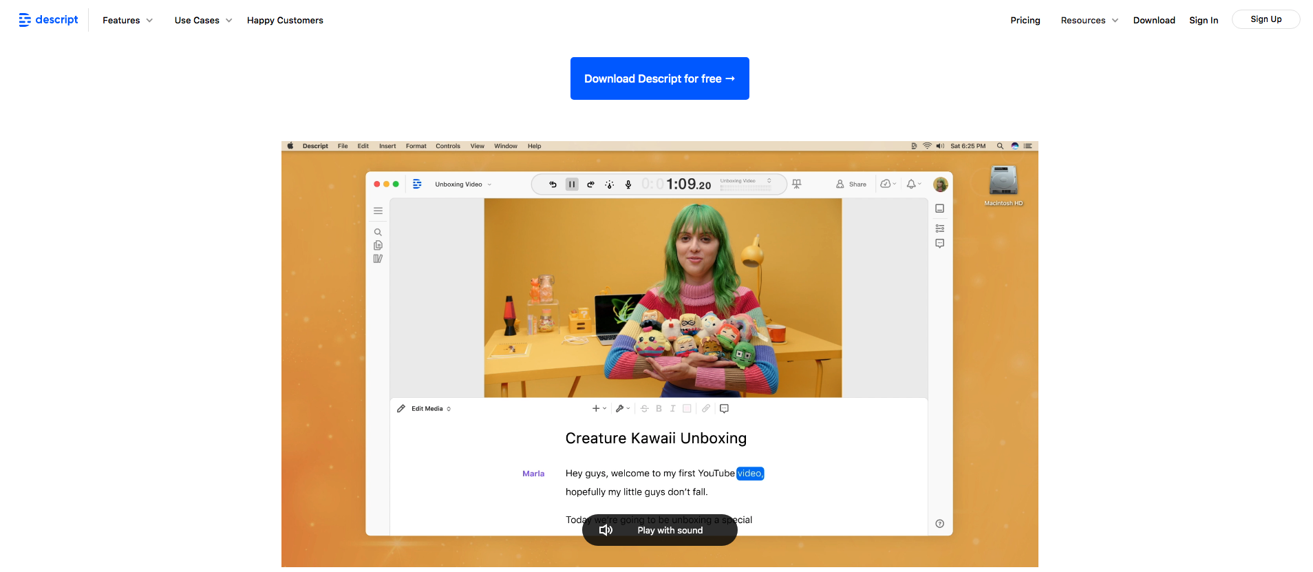
If you take a look at the Descript explainer video, you’ll see that it presents an otherwise complicated software as an easy-to-use tool suitable for anyone. It includes more than just an explanation of what the app does. The video actually walks potential buyers through the process of editing a video or podcast episode, showing off each advanced function.
Branding and Character
In addition to the design tips mentioned above, SaaS companies that really wish to stand out must find ways to establish a unique, relatable voice.
Visuals, of course, play a key role in making a brand recognizable and memorable. However, just because images and videos drive conversions doesn’t mean that you should allow your messages to be bland.
Brushing up your copy to be helpful, direct, and action-oriented is just the first step towards designing landing pages that convert. Adding character, however, is the cherry on top.
When designing (or looking to improve) your landing pages, look for opportunities to make your language more powerful. Pay attention to accuracy and readability, and try to format the content in a way that supports peoples’ preferred reading patterns.
But more than just that, look for ways to inject excitement into your words.
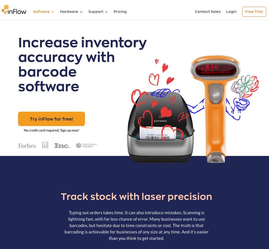
InFlow Inventory does an excellent job on their barcode software landing page, where they play with the text to add a bit of fun into an otherwise monotonous subject. Their headlines include statements like “Track stock with laser precision” and “Choose a barcode software that gives a *BEEP*.”
This is an excellent strategy for anyone on a budget, as it relies on wit instead of expensive-to-produce gimmicks. But more than being just a money-saving approach, it’s also a course of action you can implement on marketing assets like social media and PPC ads.
The Final Step
Once you’ve put together a landing page that features converting elements like high-quality imagery, engaging visual and text content, strong CTAs, and user-oriented benefits sections, it’s important to remember that your work is still not finished.
The absolute best way to ensure high conversion rates on SaaS landing pages is to continuously test and improve. By looking at the way your target audience is responding to your marketing assets and choosing to go with strategies that show the best results, you can maximize your ROI and plan future developments with ease and confidence.
There are two basic ways to measure performance.
The first would be to look at KPI in your Google Analytics account. While you can also use more advanced tools, this one will give you plenty of valuable insights on its own. Track page views, traffic sources, average session time, bounce rates, and conversion rates. It’s also not a bad idea to set up goals, which will allow you to assign a value to each of the actions your web visitors take.
The second, slightly more technical way to boost the performance of your landing pages is to run A/B tests. For each of the conversion-driving elements mentioned above, you can test two or more versions and see which ones yield the best results.
So, for example, if you’re on the fence regarding what type of visual will work best in your hero section, you can A/B test a header image against a background color.
Moreover, A/B testing is a great way to choose effective calls to action, as well as to find the best positions for valuable elements on your pages.
Summing Up
Whether you’re planning a paid advertising campaign or just want to ensure your marketing assets are as effective as possible, it’s a good idea to spend time polishing up your landing pages.
As your SaaS business grows, so will your traffic. With that in mind, even a 1 or 2% increase in conversion rates will improve your profits. Thus, you’ll have more space for product development, team expansions, or padding for your marketing budget.
By looking at the elements discussed above, you’ll have covered all the bases of effective landing page design. Of course, remember that the best business results always come from careful planning and consistent effort. So, make sure that you use all your channels to their absolute maximum potential.


