
The main purpose of paid advertising on Google or Facebook is obvious: get the right kind of visitors to your site’s landing pages and get them to respond to some kind of call to action.
When done right, paid ads on Google or Facebook offer a tremendous return on marketing spend. An added benefit over organic marketing is that it also offers a more immediate return.
Content marketing, while effective and scalable, is highly dependent on SEO, and results can only be visible months after the campaign kicks off.
Paid advertising allows you to get your landing pages in front of a targeted audience almost immediately. Of course, there are other moving parts to consider, like effective keyword bidding or appealing creative, but for the sake of this article, let’s assume that your marketing team has this under control.
How to Boost Sales by Personalizing Customer Experience
Instant results aren’t the only benefit that paid advertising offers. There are several very obvious reasons to consider it as one of your main marketing channels, its scalability and audience targeting being two of the main ones.
In this article, we’re going to take a good look at an often overlooked benefit that paid advertising offers the diligent marketer.
A Hidden Opportunity
What few digital marketers realize is that paid advertising offers them an elegant opportunity to gauge the effectiveness of the landing pages to which their advert directs people.
Simply put: it’s one of the most effective methods to conduct A/B testing on your site’s landing pages.
Mention A/B testing to many marketers, and you’re bound to trigger visions of focus groups, high-touch data gathering, and deciphering ambiguous verbal feedback.
When conducted in person, there are a plethora of variables that 3could compromise results. Small sample sizes mean that data is often unusable. Presentation methods need to be consistent so that the results aren’t skewed. And, most importantly, the knowledge that they’re being monitored often affects a test subject’s behavior.
Paid advertising offers a fantastic solution to these problems, without requiring much additional effort or investment.
Admittedly, it will require you to set up multiple similar adverts, since paid advertising platforms don’t enable A/B testing different destination pages. Most of them enable very sophisticated A/B testing of the advert itself, but the destination landing page is a constant for each of them.
By embracing this additional, highly beneficial, byproduct of each of your paid advertising campaigns, it’s possible to get a window into your visitors’ responses to different iterations of the same landing page.
Identifying pages that outperform each other based on certain critical metrics becomes a breeze, should you have access to the relevant analytics.
The beauty of leveraging paid advertising to conduct A/B testing is that it addresses each of the issues that compromise in-person tests. While at the same time still performing its primary function: getting visitors to your site.
Keep the Trigger Consistent
The relationship between an advert and its target landing page is vital. Copy and imagery that trigger a click-through are effective because they create an expectation with the user.
The user has a particular pain point that the advert addresses effectively. Whether they know it or not, they have an expectation of the information they’re going to encounter on the landing page based on the content of the advert.
“Ad scent” is a crucial principle of paid advertising best practice. It means that there shouldn’t be too big of a gap between expectations created in the advert and the content of the landing page. If you make a promise in your advert, make sure you refer to it on the landing page.
By doing this, you’re capitalizing on information you already have on your visitor: their pain point. Their reason for clicking on the ad means that there’s something about it that speaks to their needs.
That’s just a bit of background. What does this mean in the context of this article?
If you want to A/B test two different landing pages, it is absolutely essential that results aren’t skewed by testing page A with one advert and page B with another. Because each advert is going to create subtle expectations with the customer that WILL affect the way they interact with the landing page.
If your goal is to use paid advertising to improve your user experience through A/B testing, you will need to use exactly the same advert for each of the destination pages.
Limit the Elements Being Tested
This is somewhat of an extension of the logic we’ve discussed above. When it comes to A/B testing, limiting the variables being tested means that results carry more specific actionable knowledge.
If landing page A differs from landing page B only because it uses slightly larger product images, the difference in user engagement is extremely likely to be because users respond differently to this one variable.
Call to Action: Is It Still Working and How to Really Have Your Message Heard
If, however, page A also has a different call-to-action label and longer product descriptions, the reason for users’ improved engagement is anyone’s guess.
Visual design elements, be they imagery or copy, don’t exist in a vacuum. How a user interacts with one element is hugely influenced by other page components – and not always in a predictable way.
To get the most out of A/B tests, be comfortable with testing as few elements as possible against each other. Mining more meaningful results over a longer period of time is much better than a larger set of ambiguous data extracted from a “larger” experiment.
Embrace Persistence
Once again, it’s really important to go into A/B testing with a particular UI element in mind – the wording of a call to action (CTA), for instance.
Once the test has been completed and it’s obvious that “Buy Now!” has a much higher chance of converting than “Add to Cart,” it may be tempting to think that your research has yielded a silver bullet.
Careful with this assumption. While it may seem like overkill, there is immense value in continued testing.
Sure, pouring additional overhead into additional tests that have already indicated a clear “winner” isn’t necessary for every single page or every component on that page.
But, as we’ll discuss in the next section about prioritization, not all landing pages are created equal. And neither are the visual elements they’re composed of.
When you’ve identified high-priority landing pages and visual elements, get comfortable with the notion that you may never stop testing alternatives to its current iteration.
David Ogilvy famously said: “Never stop testing, and your advertising will never stop improving.”
While this advice may have been dispensed in 1962, it’s never been more applicable than in an age where customer interaction and engagement metrics are at our fingertips.
Browsers are able to harvest and retain vast amounts of data about a user’s session on your site. Sophisticated, highly innovative applications help parse this raw information into real knowledge – knowledge that savvy marketers and designers can leverage to continuously implement improvements on their platforms.
Get comfortable that even the “winning” button color or headline copy can always be improved. If they’ve been identified as high-priority elements, make sure they’re flagged for continued reassessments.
There’s virtually no ceiling when it comes to improving engagement or conversion statistics.
Embrace this and continuously make use of paid advertising to improve your website’s performance.
Prioritize Correctly: Use the 80/20 Principle
If we’ve done our jobs correctly so far, we’d have convinced you to at least consider using some of your paid marketing campaigns to conduct A/B testing.
One of the main reasons some of you may still be a little reluctant to follow through with this is the perceived scope of the task.
If you feel overwhelmed by the sheer amount of work that will go into A/B testing dozens of landing pages and all of the elements that comprise them – relax. We’re about to make things much easier for you.
There’s a principle that can be applied to pretty much any aspect of business, but it’s especially handy when performing any kind of prioritization exercise.
Broadly, the 80/20 principle states that 80% of a company’s results come from 20% of the work they do. There’s virtually no part of running a business that this aphorism doesn’t apply to.
Obviously, this statistic applies only over a very long period of time, and there are exceptions, but it is generally regarded as being true.
The operational implications of this statement are so staggering that it’s almost impossible to extract more logic from it without laughing.
Think about it. In a sense, four of the week’s five working days results in 20% of your company’s revenue. Meanwhile, one day results in 80%.
There’s no end to the ways that this principle can be scrutinized in order to improve your business, but for the purposes of this article, we’ll stick to our theme.
In the context of this article, the 80/20 principle means: 20% of your website’s landing pages or UI elements are responsible for 80% of your conversions (or whatever you want to define as a conversion).
Armed with this knowledge, it should be pretty clear which pages you should be A/B testing.
Sure, your home page is a critical piece of digital real estate, but have a look at Google Analytics or whatever tool you’re using to harvest this kind of knowledge. How many times can you draw a direct line between the home page and a visitor booking your service or signing up for your newsletter?
Obviously, there will be many, but we’re hoping you’re seeing the point we’re making here.
How many discussions has a design or management team had over the placement of a logo, the exact phrasing of a tagline, or the size of the CFO’s profile image on a page that has no direct relationship with conversion?
DO NOT A/B test these pages. DO NOT A/B test these elements.
Yes, they contribute to your site’s credibility. Yes, they play a very important role in your digital presence. But recognize that the role they play may be negligible when it comes to the customer adding something to their cart or submitting their email address.
A/B testing done right is a big effort. We haven’t tried to sugarcoat this. Yes, appropriating ad campaigns for this purpose lightens the load a lot, but there’s still a ton of legwork involved if you want to do it properly.
Don’t be tempted to A/B test aspects of the site that seem important but don’t have a direct correlation with conversion. Even consider omitting those that play a very small role in conversion.
A smart CMO or any marketing specialist who knows their way around Google Analytics will be able to identify what these pages are.
Prioritize making the most valuable assets in your marketing/sales funnel even more effective. The rewards are exponentially larger than tweaking a page or element that has marginal value.
Examples
Birchbury “Bramfords” Shoes
The original instance of Birchbury’s Home Page – which doubled as the pre-order page for their initial product, the Bramfords shoe – yielded a less than stellar conversion rate during a focused Facebook advertising campaign.

After doing some research, Birchbury’s marketing team decided to draw more visual attention to the discounted price of the shoe.
In the initial design, the discount was only referenced inside the product description copy, and would definitely be missed by a visitor whose eyes were caught only by the most visible elements on the page: the product gallery and the price indicator.
Birchbury decided to make some changes to the landing page mid-campaign, testing a different instance of the page. In the second version, the product’s price was displayed next to a “struck through” visual of the usual price: $150 (along with some copy changes).

This turned out to be a much more effective and immediate way to communicate the deal that the customer was getting. There was no need for them to read through a wall of text to understand that they were being offered a huge discount.
By leveraging an existing, mature paid ad campaign, which had already yielded specific sales metrics, Birchbury was able to instantly see how their website’s experience was improved.
This resulted in a permanent change to the home page and a very impressive 85% increase in conversion rate.
Gili Sports Stand Up Paddle Boards
This adventure sports company opted for a high-impact hero image that occupies the entire “above the scroll” section of their home page.

Site designers may have felt that showing one of their flagship products being used in such an entertaining way will engage prospective customers and urge them to scroll down to see the products and their calls to action.
This is a brave and unconventional design approach and one that is ripe for a thorough A/B test.
By applying the methods we discussed – running concurrent adverts that link to an alternative design, Gili Sports will be able to gather incredibly valuable information on user engagement in a very short period.
An alternative landing page design could easily be deployed – possibly one that reduces the size of the hero header to give more visual priority to the products themselves. Currently, users need to scroll quite a way down the page before they are presented with products they may be keen on purchasing.
This test will produce highly valuable data on two metrics that should concern the site owners: bounce rate and click-through rates.
Ideally, website visitors will spend enough time engaging with the content on a landing page before closing it. Not seeing the products they are interested in is a factor that could easily contribute to a high bounce rate for this page.
Click-through percentage to the product pages themselves, where the user is prompted to perform the key action of adding a paddle board to their shopping cart, is also critical to improve.
LFA Capsule Fillers
The homepage of LFA Capsule Fillers dedicates a large section of its real estate to detailed descriptions of their four main products: manual capsule fillers, capsule filling machines, empty capsules, and excipients.
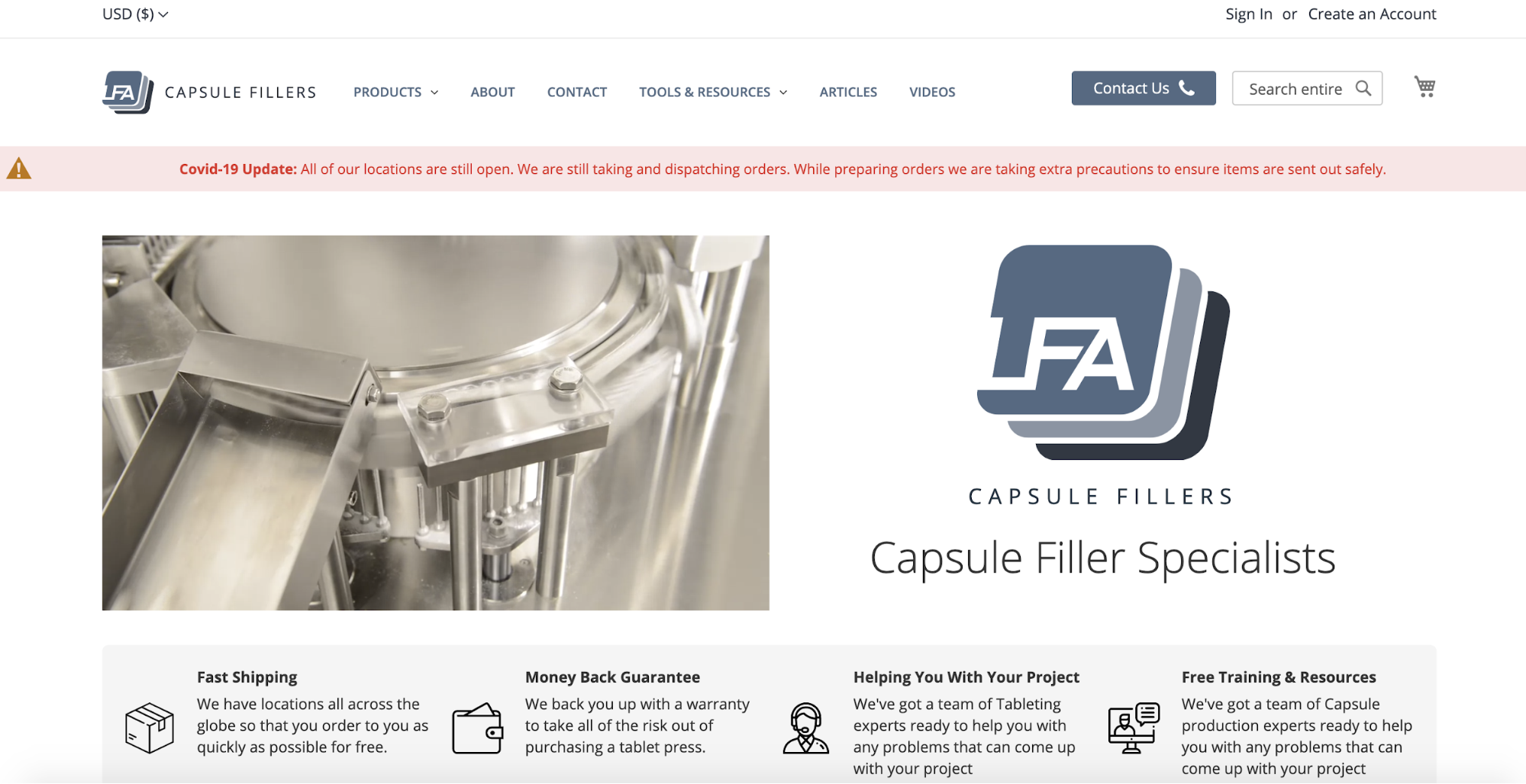
The order of these four products is very likely to be determined by the products’ sales history, with the most popular product occupying the top space, and the rest placed in descending order of popularity.
It’s very reasonable to expect that this approach would maximize conversions. Giving top billing to their flagship product is an obvious strategy to drive traffic to the product that’s most likely to sell.
However, this would be an assumption that can be tested easily. It’s possible that their most popular product would generate the same amount of sales regardless of its position on the list. Meanwhile, placing a less popular product at the top – possibly one that customers weren’t aware of – could result in a massive spike in its sales.
Again, running an A/B test using a paid advertising campaign is an excellent strategy to test this approach and gauge its feasibility in a very short period.
Zoma Sports Mattresses
Mattress company Zoma makes it incredibly easy to reach their flagship product page. Once the user finds themselves there, they’re presented with a beautifully designed combination of UI elements – the most critical one being the “Add to Cart” call to action.
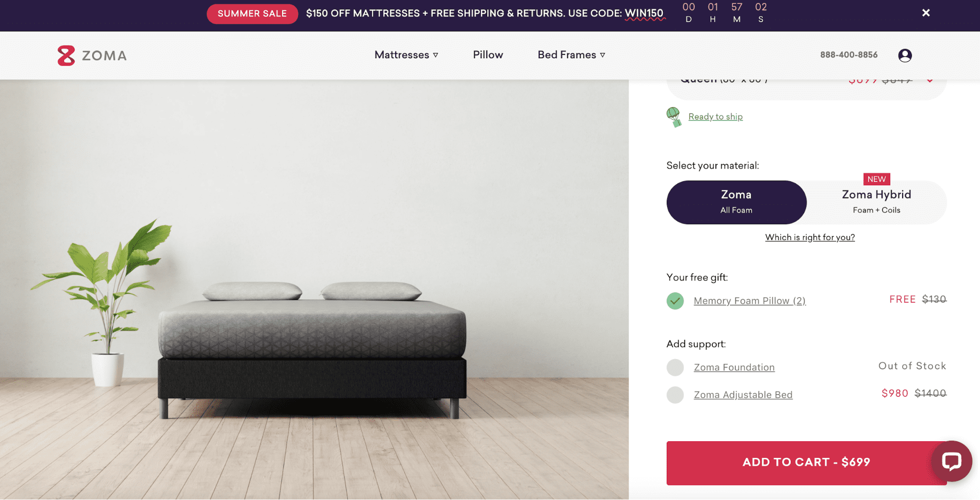
The importance of this button makes it one of the most-tested elements in web design. There’s a wealth of online data discussing the various psychological triggers that prompt a user to either click on it or not. Placement, color, and text content are the variables that are most frequently debated when it comes to the effectiveness of this button.
Here, Zoma has the option to A/B test a number of various designs. Using a paid advertising campaign to do it is a super effective way of building their data quickly.
Does placing the button below the scroll-line affect conversion? –Simply create an alternative page where it is placed above the product description text.
Will a different color draw more attention to it? What about the content? Does including the price on the button label scare off prospective customers? The same testing solution will apply.
As we’ve already noted, however, the best way to gather knowledge on these changes would be to implement each of them in separate tests. If all of the above variables are tested on the alternative design, it’s anyone’s guess as to which one resulted in a different conversion rate.
In Conclusion
A/B testing isn’t something any company should avoid. If you’re not already doing it, then your business is extremely likely to be operating at a subpar ROI.
The availability of information, services, and software to facilitate the constant improvement of your site’s user experience means that there simply aren’t any excuses not to be doing something that offers such great rewards. And the effort involved in gathering A/B testing results is extremely feasible if you leverage existing marketing efforts smartly.
By using your paid ad campaigns to test different versions of your site, you’re killing two birds with one stone. You’re not only gaining targeted traffic, but also giving yourself the opportunity to harvest critical information that will help you maximize the likelihood of conversion.