When you’re trying to appease someone, first impressions are everything. Regarding your landing pages’ visitors, they form those impressions in about 50 milliseconds. That’s less than the blink of an eye.
So, if you’re willing to draw in as many customers as possible, you’ve got to design those pages with your target audience in mind.
Today, we’ll be exploring the art of crafting customer-centric landing pages that grab attention and hold it, compelling your audience to take action. Our journey will lead us through five valuable tips that ensure your landing pages are both eye candy and powerful conversion machines.
Stick around for some real-deal examples that show these tips in action, proving that great advice isn’t just about saying the right things but about showing how to make them work for you.
1. Showcase Social Proof
Imagine walking into a crowded restaurant on a Friday night, while the place next door is empty.
Which one do you choose?
You’ll probably go for the tried and tested option. That’s social proof in action – a powerful tool that influences our decisions.
From a customer’s viewpoint, picking the right product or service is all about trust. In fact, according to a recent study, 72% of consumers will postpone making a purchase until they read genuine customer reviews.
So, how do you nail social proof on your landing pages?
- First, keep it authentic. Real reviews, genuine testimonials, and actual customer stories beat crafted marketing messages any day.
- Include photos or videos if you can, as they add a layer of authenticity that’s hard to match with text alone.
- Make sure these testimonials are easy to find and read. They should blend seamlessly with the design of your landing page but still stand out enough to catch the visitor’s eye.
Now, let’s examine this from some real-world perspectives:
SomniFix, a brand known for its innovative mouth strips that promote better sleep, leverages social proof brilliantly on its SomniFix Mouth Strips landing page.
They feature a dedicated section highlighting thousands of five-star reviews from customers who’ve experienced significant improvements in their sleep quality.
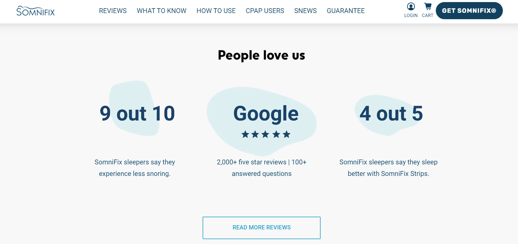
This approach demonstrates the product’s effectiveness and builds a community feel, encouraging new visitors to trust and try their products.
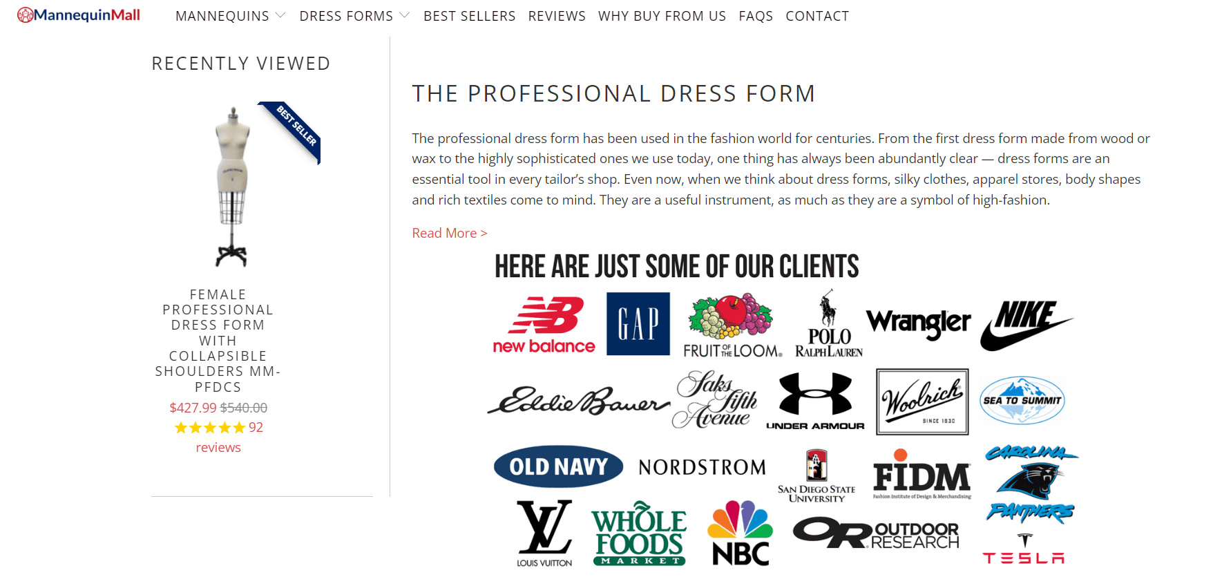
On the other hand, Mannequin Mall, a go-to retailer for fashion mannequins, uses a different yet equally effective strategy. Their Professional Dress Forms landing page showcases the logos of well-known companies they’ve partnered with.
This subtle yet powerful display of trust from established brands serves as a strong endorsement, signaling to potential customers that they’re in good company. If industry leaders are on board, it reassures others that they’re making a safe choice.
Both SomniFix and Mannequin Mall understand that at the heart of effective customer-centric landing pages lies the power of social proof.
By strategically showcasing it, they bolster their credibility while forging a stronger connection with their visitors, guiding them one step closer to making a purchase.
2. Employ the Power of Video
Videos can be a more demanding task for you than scribbling a wall of text, but for customers, they represent a quick, efficient way to gather information without sifting through dense text.
With video, they can see a product in action or grasp a service’s benefits in under a minute. It’s no surprise that landing pages with videos can increase conversions by over 80%.
Here’s how to harness the power of video effectively:
- Clarity and brevity are key.
- Ensure your video directly addresses the needs or concerns of your potential customers.
- Keep it short. Aim for 2 minutes or less to hold viewers’ attention.
- The video should be prominently placed but not intrusive, allowing visitors to engage with it at their own pace.
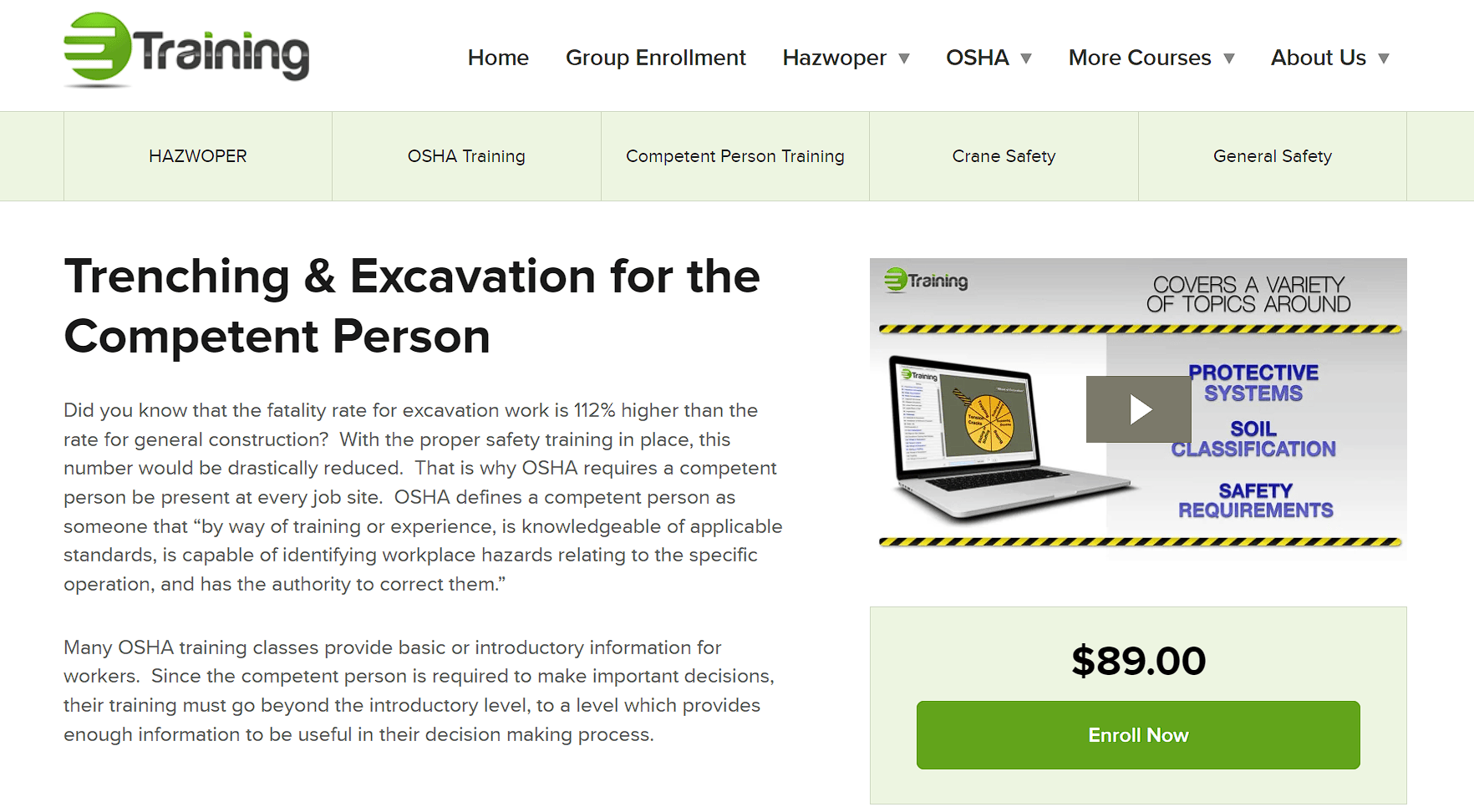
eTraining, a provider of online workplace safety training, sets a prime example. On their Trenching & Excavation for the Competent Person landing page, they place a compact video right at the forefront.
This video is a gateway into what the training course covers, highlighting its relevance and the value it offers to prospective learners.
By choosing to explain the course through video, eTraining not only captures interest faster but also adds a layer of personal touch. Viewers can sense the expertise and care behind the course, making the decision to enroll that much easier.
This strategic use of video proves to be a powerful tool in eTraining’s arsenal, enhancing user engagement and ultimately driving conversions.
3. Leverage Negative Space
Negative space, often overlooked, is a potent tool in design, particularly on landing pages.
From the customer’s point of view, this “empty” space is anything but. It creates a breathing room around content, making the page feel uncluttered and the information easily digestible.
This approach respects the visitor’s need for clarity and simplicity, guiding their focus to what truly matters: your message and CTA.
Here’s how to employ minimalism to get your message across:
- Balance is essential. Too much negative space might lead to a sparse, underwhelming page, while too little can overwhelm and confuse.
- The key is to use negative space to highlight your most important elements, such as your value proposition, CTA, and key benefits.
- This doesn’t mean large swathes of the page should be blank. Instead, ensure that content is thoughtfully spaced to draw the eye naturally through your narrative.
Pocket, a service for saving web content for later viewing, showcases the effectiveness of leveraging negative space on their Pocket Hits Newsletter landing page.
The design on this page is a masterclass in minimalism, featuring a clear, concise header that communicates the main value proposition alongside a straightforward subscription field.
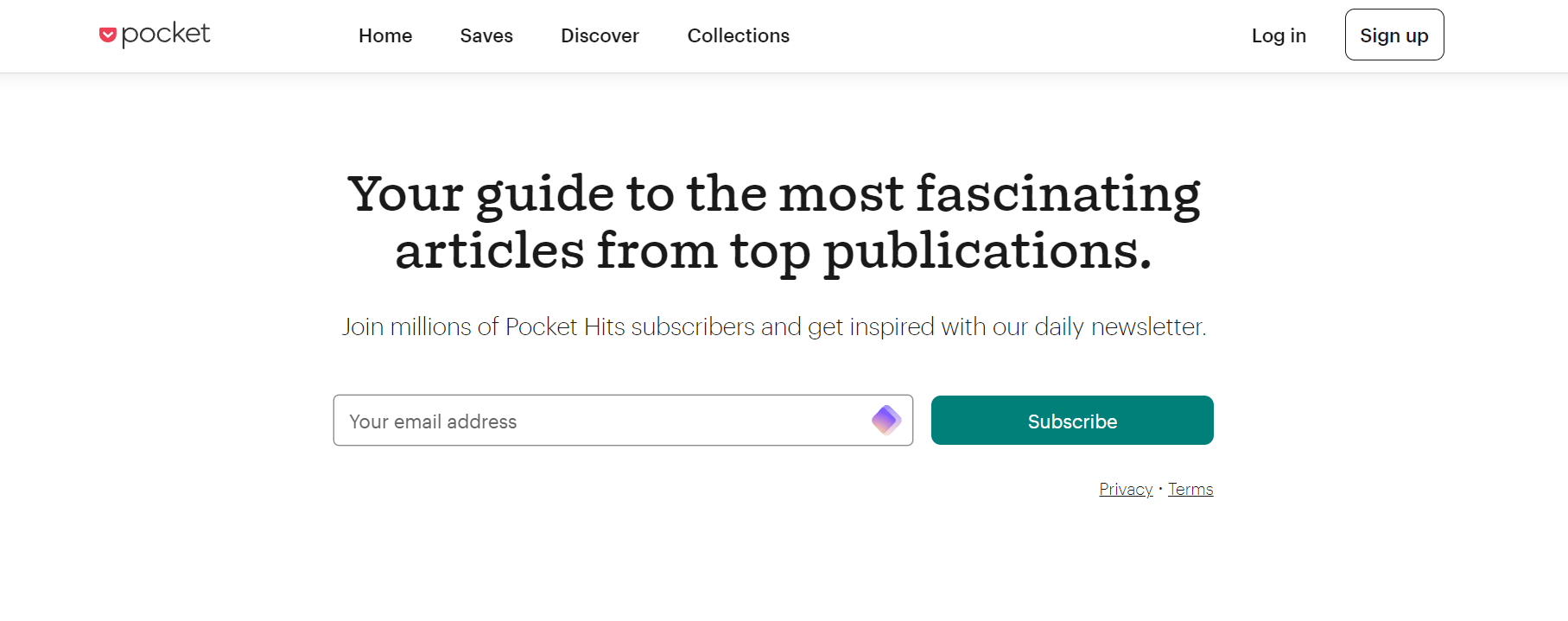
This use of negative space around these elements makes them stand out, encouraging action without distraction. The result is a landing page that feels inviting and easy to engage with, encouraging visitors to subscribe with minimal effort.
By using negative space to its advantage, Pocket enhances the user experience while efficiently driving conversions, proving that sometimes, less really is more.
4. Use Clear and Consistent Product Imagery
Clear and consistent product images are more than a design choice. They’re a communication tool that speaks volumes to customers.
From their perspective, these images are a window into the product’s world, offering a glimpse of what they can expect. High-quality, consistent images reassure customers about your products’ quality and help them visualize owning them, which is vital in the absence of physical touch and feel.
Here’s how to concisely display your products in their true form:
- Ensure that all product images are of high resolution, offering a zoomed-in view to reveal finer details.
- Consistency in lighting, angle, and background across all images helps maintain a coherent look that supports brand identity.
- This uniformity makes it easier for customers to compare products and sets a professional tone for the entire page.
Moto Machines, a retailer specializing in motorcycle accessories, excels in using clear and consistent product imagery. On their landing page for Hepco & Becker products, each item is showcased in its entirety, captured in high-resolution images that highlight the product’s design and quality.
The uniform style across all images not only makes the page visually appealing but also simplifies the shopping experience. Customers can easily navigate through the offers, knowing what each product looks like, which aids in making informed decisions.
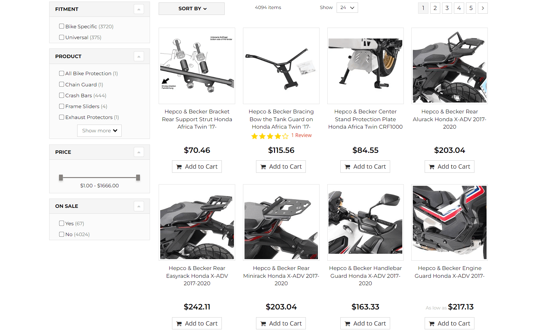
By prioritizing clarity and consistency in product imagery, Moto Machines effectively bridges the gap between online browsing and the tangible reality of their products, enhancing customer trust and satisfaction.
5. Incentivize with Your CTAs
For customers navigating a digital landscape brimming with options, a call-to-action (CTA) that offers an extra nudge can be the deciding factor.
CTAs have the power to urge customers to take the next step, and more importantly, they can make the next step irresistible.
Upgrading your CTAs with additional incentives can significantly enhance their appeal, providing a clear value proposition that makes the action feel rewarding.
Here’s how to take your CTAs to the next level:
- Blend the incentive seamlessly with the action you want the user to take.
- The incentive should be immediate and relevant, such as a free trial, a discount, or access to exclusive content.
- This can boost the likelihood of engagement and establish a positive first interaction with your brand.
- Also, ensure the language is clear, compelling, and directly tied to the benefit so users know what they gain by clicking.
Streak, a CRM tool for Gmail, showcases this strategy effectively on their Email Tracking Service landing page. Their CTA button, labeled “Get Started,” is paired with a powerful motivator – “It’s Free.”
This simple addition transforms the CTA from a generic invitation into a no-lose proposition, leveraging the universal appeal of “free.” It communicates value and reduces the perceived risk of trying something new, encouraging visitors to take the plunge and engage with Streak’s service.
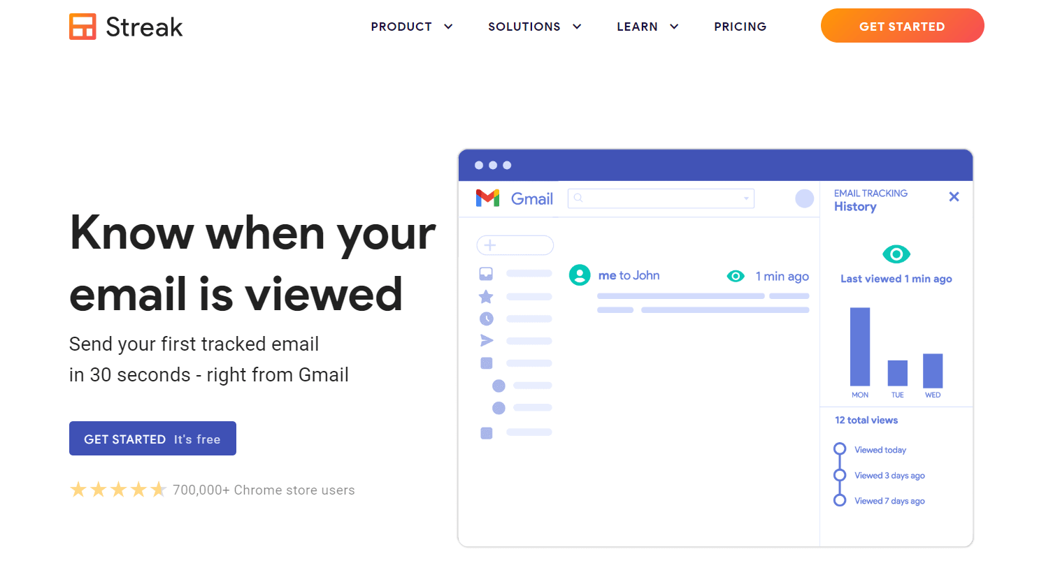
By crafting a CTA that doesn’t just ask but also rewards, Streak increases the chances of conversion and begins building a relationship based on value from the very first click.
Final Thoughts
Embarking on the journey to create customer-centric landing pages is a step towards transforming how your audience interacts with your brand. Armed with these tips, you’re now more prepared to craft pages that resonate with your visitors while driving them toward action.
Dive in, apply these strategies, and transform your landing pages into powerful conduits of customer engagement and conversion.