Two things remain irretrievable: time and a first impression.
This insightful quote hits home when it comes to summing up the importance of capturing your potential customer’s attention the moment they set their proverbial foot on your landing page.
And what makes achieving this goal even trickier is that you don’t have too much time to do that.
According to research, it takes no more than 50 milliseconds for people to form an opinion about your site. In other words, if your visitors aren’t impressed with what they see at first glance, they will bounce off, and you will lose a business opportunity.
This blog post will discuss some effective tips to help you create an irresistible landing page that will get your potential customers to stick around long enough to hear your pitch.
1. Take Advantage of Interactive Content
Research studies have shown that our attention span has dwindled to a mere 47 seconds, meaning your potential customers won’t stay on a landing page that doesn’t pique their interest enough.
That’s why you should pull out all the stops, and interactive content will not only catch your visitors’ eye from the get-go but also sustain their interest by inviting them to actively participate rather than passively scroll.
These clickable quizzes, calculators, infographics, and other interactive content formats have the ability to engage visitors and keep them on your landing page longer, thus increasing the odds of conversion.
Besides this increased engagement, another benefit of leveraging interactive content is enhanced personalization. Namely, unlike static content, it requires users’ input, and based on the information they provide — quiz answers or calculator data, they will get unique, personalized answers tailored to their unique needs and preferences.
Finally, the information you collect using interactive content can later be used to create targeted marketing campaigns in the future.
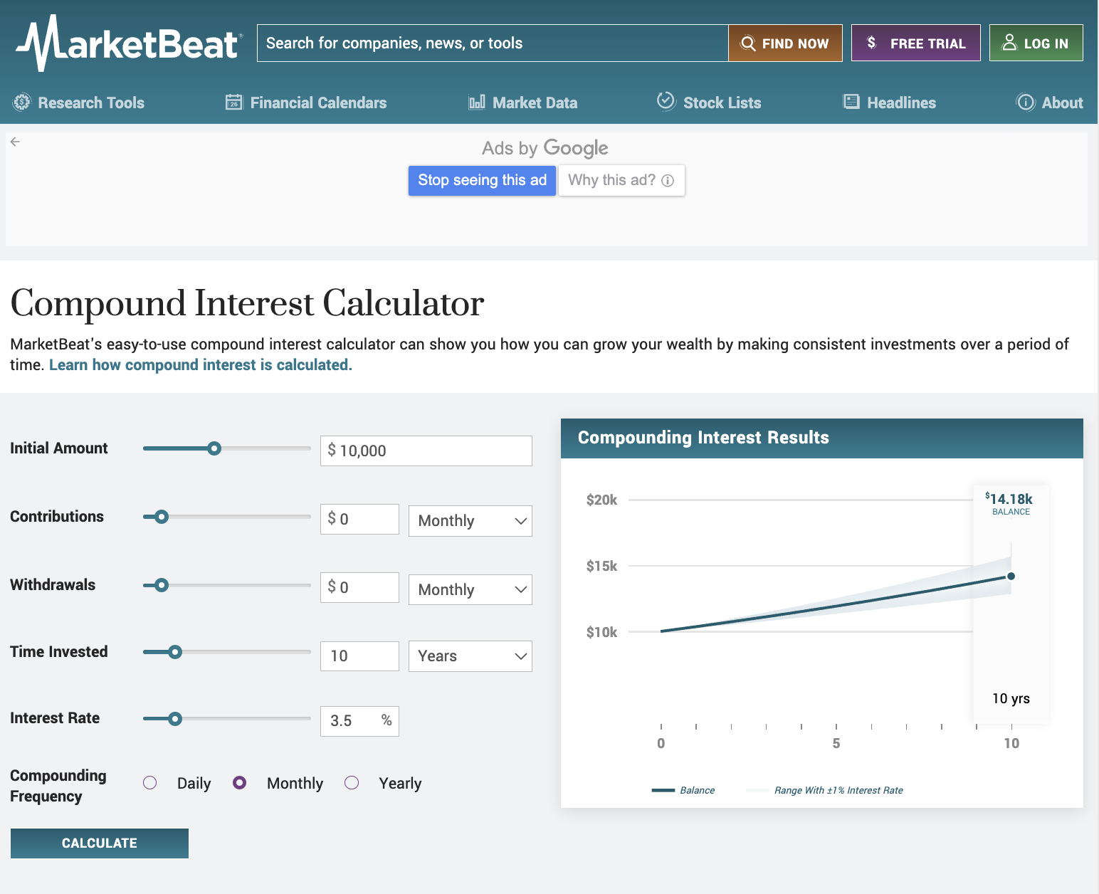
MarketBeat’s Compound Interest Calculator is a great example of this tactic. This landing page encourages users to participate by adding value. It saves them a lot of time and effort they would otherwise spend trying to figure out how much their investment will grow over time.
2. Provide Customer Service Information
Having easily accessible contact information on your landing page can immediately build trust. It assures visitors that your company is legit, stands by its products or services, and is available to provide customer support.
This tactic will reduce friction during the buyer’s journey. Your fence-sitting prospects who can’t make up their minds about making a purchase probably have questions or concerns about the product or service. If they can’t find immediate help on the landing page, they will be more likely to bounce off and possibly go to a competitor.
So, having contact information readily available can be the nudge that pushes them from contemplation to conversion.
Here’s how you can optimize this landing page element and maximize conversions:
- Make sure the customer service information is easy to find but not distracting from the main content or call to action.
- Offer multiple ways to reach out, such as phone numbers, email addresses, and a live chat feature. This way, you’ll cater to customers from different time zones.
- Integrate customer service features seamlessly into the mobile version of your landing page. Remember that almost 60% of website traffic comes from mobile devices, so not accommodating potential customers who access your landing pages from their smartphones means leaving money on the table.
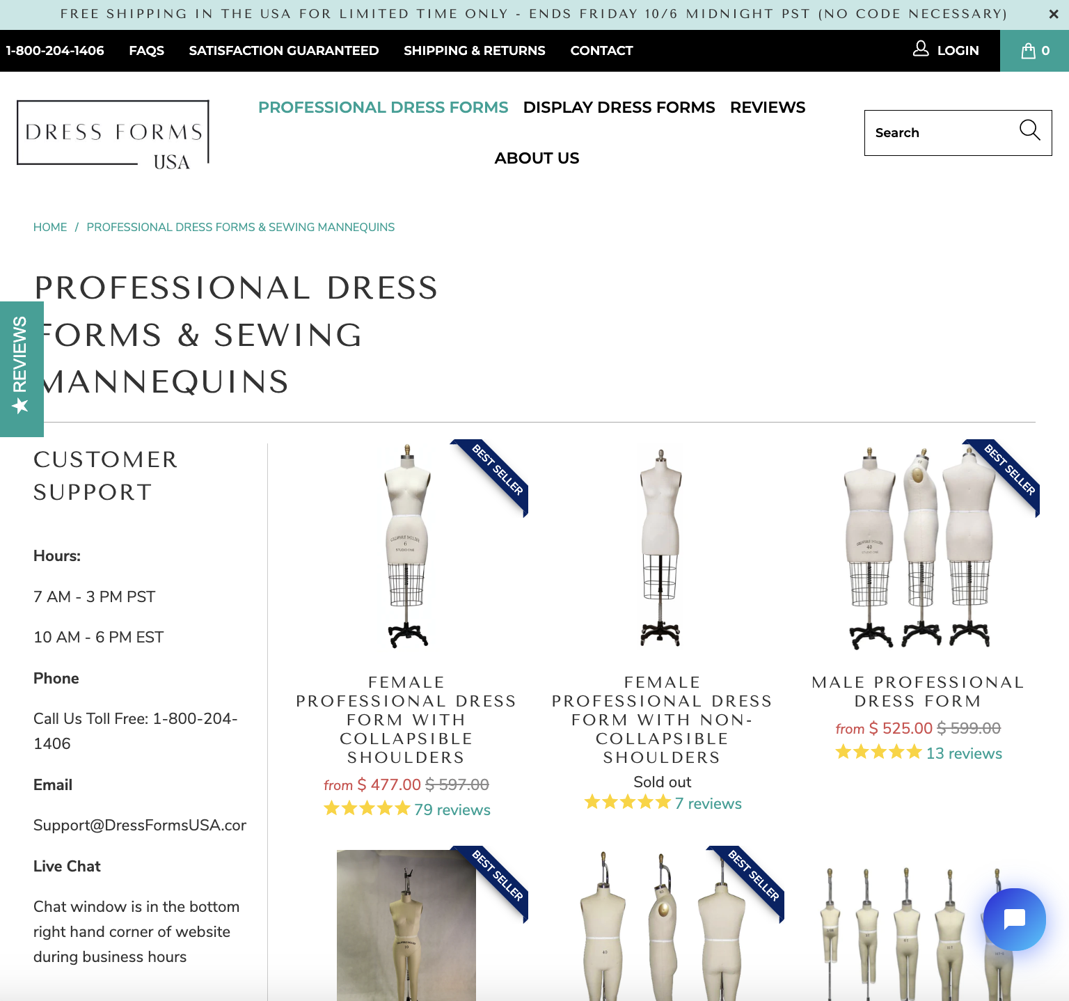
Dress Forms USA checks all the boxes, as their professional dress forms landing page has prominently placed customer service and contact information both above and below the fold. The company goes out of its way to make it as easy as possible for potential customers to reach out. There’s even a toll-free number for those who prefer this old-school channel. The landing page is also mobile-responsive, and the phone number is clickable so that visitors can conveniently place a call through their provider.
You can achieve the same effect by adding the frequently asked questions (FAQ) section. This way, you can address potential customers’ issues and concerns related to the product, ordering, shipping, customer service, or anything else that stands in the way of a smooth customer journey and decision-making process.
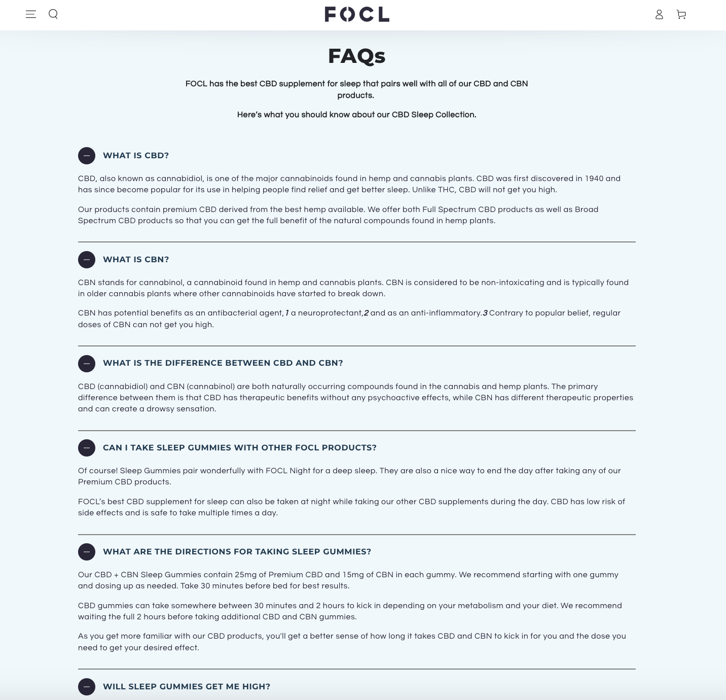
FOCL’s CBD For Sleep landing page lists a number of frequently asked questions aimed at helping prospects make informed decisions. People who aren’t familiar with the difference between CBD and CBN might be reluctant to give these sleep supplements a try and enjoy their benefits. Instead of expecting potential customers to look for answers elsewhere and adding another unnecessary step to the customer journey, FOCL keeps them engaged by providing clear, concise answers right there on the landing page, thereby increasing the likelihood of conversions.
3. Include Social Proof
Social proof is one of the most powerful conversion drivers.
The truth is that people are heavily influenced by the actions and behaviors of others around them. In other words, whenever we’re not sure what to do and how to behave in certain situations, we copy others and follow their lead. This applies not only to our everyday lives but also to buying decisions, and that’s what social proof is all about.
So, if you want to build trust, persuade your potential customers they’re making the right decision, and add credibility to your business, then add customer reviews, trust badges, awards, user-generated content, or logos of your well-known customers to your landing page.
But why does this interesting psychological phenomenon work so well?
Stats say that displaying reviews can boost conversion rates by 270%. The reason for this is that they serve as a form of endorsement from real users who have tried and tested your product, providing potential customers with the assurance they need to proceed with a purchase.
Given that 91% of consumers trust online reviews as much as personal recommendations, it’s obvious that you should back up your product claims with this type of social proof.
To enhance the transparency and underscore the authenticity of your social proof, make sure to include both raving and not-so-good reviews, as your customers will appreciate your honesty.
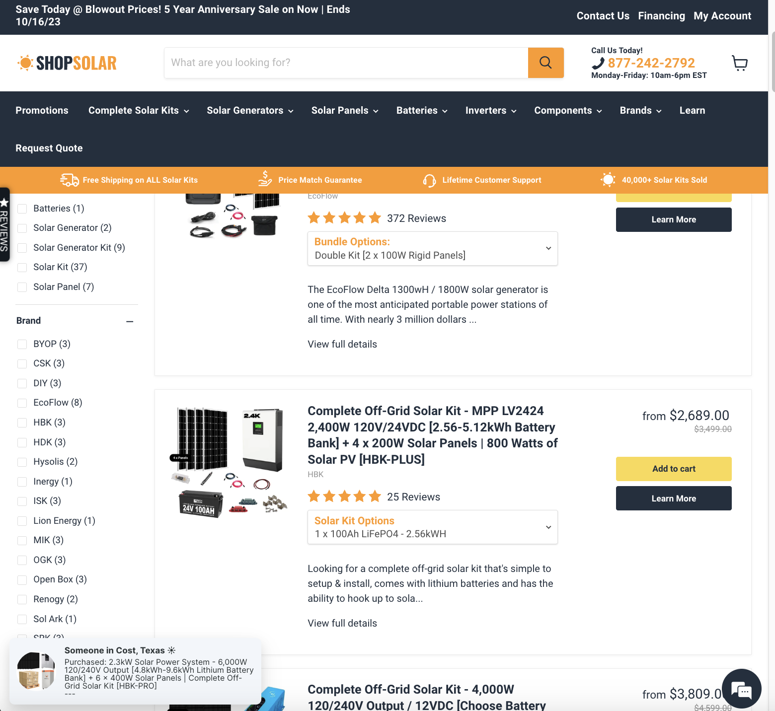
Shop Solar’s landing page comes with several different kinds of social proof. There are customer ratings and reviews next to each product, while a floating Reviews tab takes visitors directly to an entire web page dedicated to reviews. Besides, every time someone makes a purchase, there’s a pop-up notification informing visitors about it, generating FOMO and boosting conversions in the process. Finally, the header reads “40,000+ Solar Kits sold,” which is another way of convincing customers that the shop is popular and that they have nothing to worry about.
4. Embrace Negative Space
In many cases, design isn’t just about what you see but also about what you don’t see.
Negative space is a design tool referring to the empty or unused areas around text, images, and other visual elements.
Far from being wasted space, whitespace is used to guide your visitor’s eye and help you establish a better visual hierarchy and balance on your landing page. Bear in mind that the prefix “white” shouldn’t be taken literally — negative space can be any color or image. The point is to create a well-proportioned, clean layout that directs the viewer’s attention to key elements, thereby improving both readability and conversion rates.
Leveraging negative space on your landing pages will:
- Enhance the readability of your copy. Ample whitespace around text, tag lines, and CTA buttons improves legibility and gives your content room to breathe, making it easier for visitors to focus and process the information.
- Improve the content flow. Negative space can act as a directional cue, subtly guiding visitors toward your CTA buttons or highlighting the message you want to communicate.
- Reduce cognitive load. A cluttered page outlay overwhelms the user. Negative space minimizes distractions and helps focus attention where it matters most.
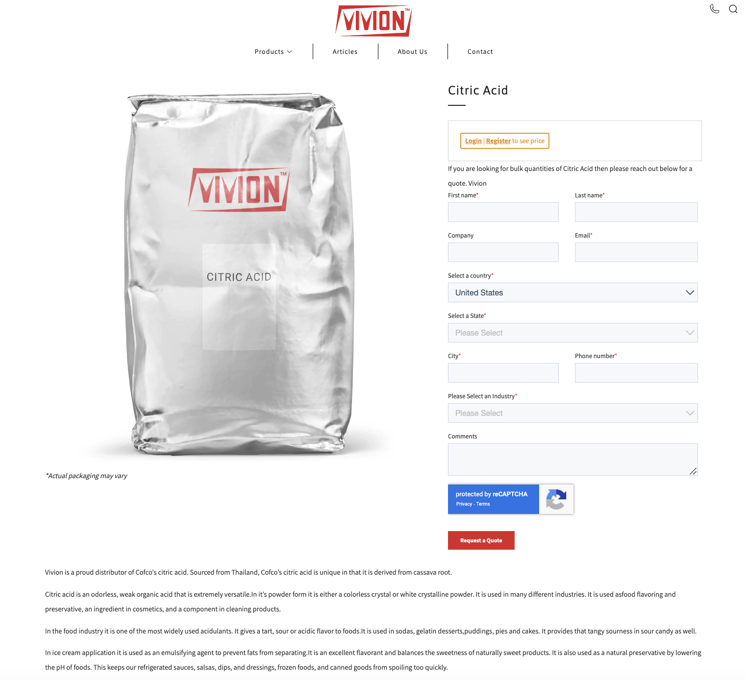
Vivion’s Citric Acid landing page is easy on the eyes. There’s a lot of white space both around the image and the copy, which creates a visual break, allowing visitors to explore the product smoothly and without being confronted with too many stimuli.
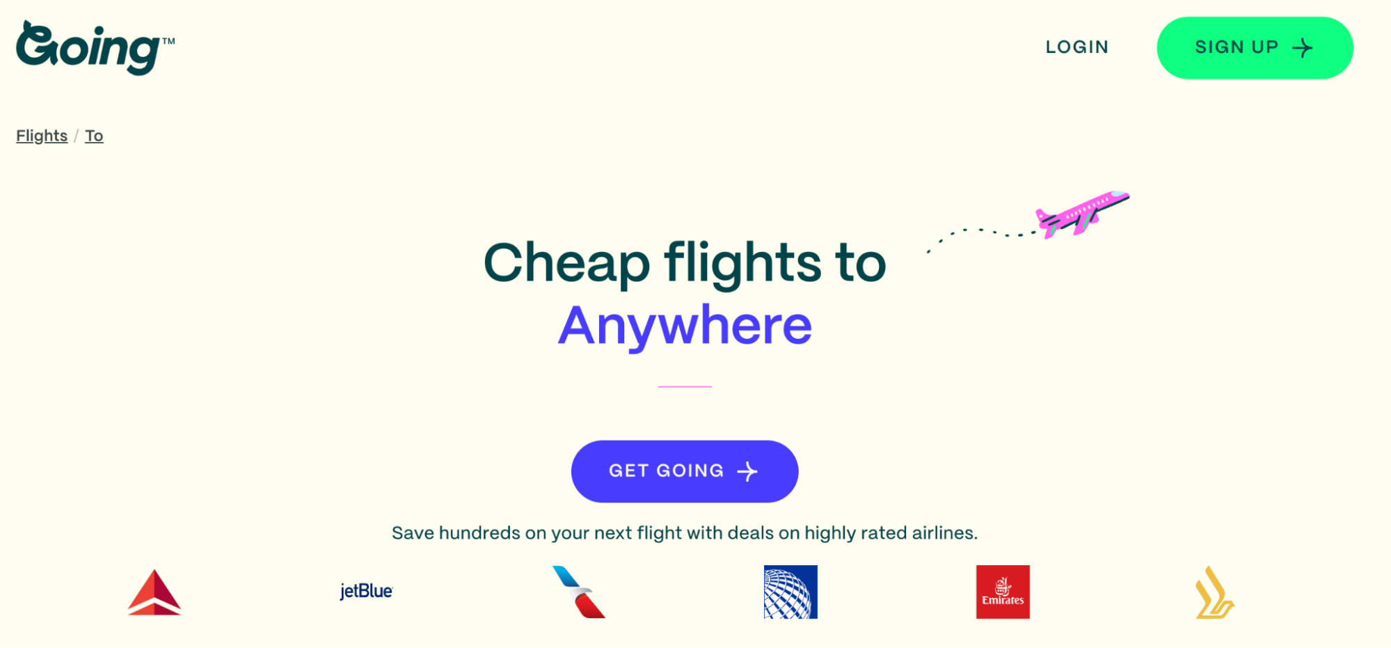
Going takes a similar approach with their minimalist Flights to Anywhere landing page. They managed to hit the sweet spot — too much negative space can make a page seem incomplete, while too little makes it crowded. Different background colors break the monotony and help delineate content sections without overwhelming the visitor.
5. Make Your CTAs Visible
A conspicuous CTA is at the heart of every high-converting landing page. This is the moment of truth where your visitor decides to engage further with your brand or move on (or not!). Ensuring your CTA stands out can make all the difference between a sale and a missed opportunity.
The first and most critical rule for crafting an effective CTA is to actually have one. It’s not enough to simply invite your visitors to take action by including a link and burying it in a block of text. A CTA button(s) needs to exist on its own.
Other factors that make a call to action successful are
- Contrasting colors. Using a color that stands out from the rest of the page ensures that your CTA will grab visitors’ attention.
- Placement. The CTA should be positioned so that it follows the natural flow of the page. Place your primary CTA above the fold so that visitors who don’t scroll down can notice it. Secondary buttons should be placed strategically throughout the page. This trick will make sure those who want to explore your page in detail don’t forget about your offer.
- Size and shape. An effective CTA button is large enough to be easily clickable but not so large that it overwhelms other content. When it comes to the shape, make sure your CTA actually looks like a button, either oval or rectangular.
- Urgency and scarcity. Use time-sensitive language or indicate limited availability to prompt your potential customers to take action.
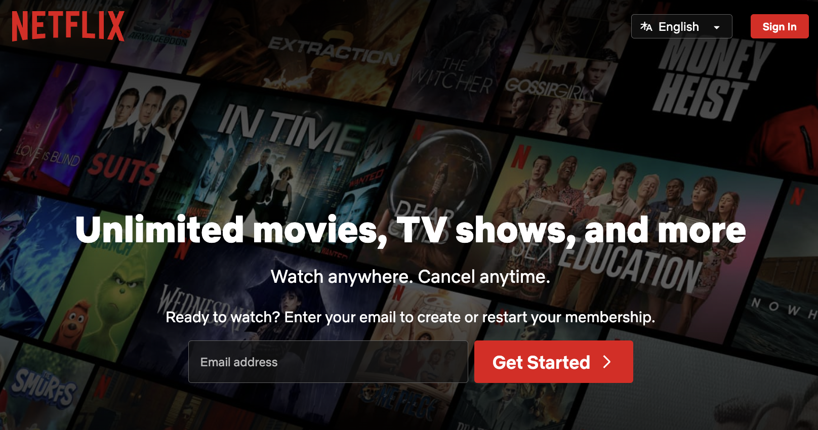
Netflix uses several striking red calls to action that stand out against a dark background. There are two buttons above the fold and one at the bottom of the page. Each of them has the same goal — to prompt visitors to subscribe.
In Closing
Every landing page is a powerful tool for attracting and converting prospects into paying customers. It showcases your value proposition, addresses your audience’s pain points, and persuades them to take action, so don’t take the process of creating and designing your landing pages lightly. Follow the best practices we discussed, but make sure to track your metrics and identify the tactics that work for you.