You’ve worked hard to get visitors to your website. The traffic numbers look good, but sales aren’t matching up.
That’s because 96% of new visitors aren’t ready to buy right away. They’re just looking around, checking you out, and deciding if they trust you. This gap between traffic and sales frustrates countless business owners.
To fix this, you may be urged to drive more traffic to your site. However, the actual fix is converting the traffic you already have. Your sales funnel needs to meet first-time visitors where they are and guide them naturally toward a purchase decision.
To help, we’ve gathered the most effective strategies that don’t require a massive budget or technical expertise. All that’s needed is some thoughtful implementation of proven techniques that respect where your visitors are in their buying journey.
Let’s explore five practical ways to welcome new visitors and start them on the path to becoming loyal customers.
1. Jump Right Into Spotlighting Your Flagship Product
When visitors land on your site, they’re making quick judgments. That’s why you’ve got only a few seconds to show them what you offer and why they should care.
Immediately featuring your top product cuts through the noise and gives new visitors a clear entry point into your brand experience.
This approach works because it eliminates decision fatigue. Instead of overwhelming visitors with options, you’re confidently showcasing what you do best. It’s also efficient – visitors immediately understand your core offer without having to search for it.
To get this right:
- Position your flagship product prominently above the fold on your homepage.
- Include a compelling, benefit-focused headline that speaks directly to visitor needs.
- Add a clear CTA button that stands out visually.
- Use high-quality images showing the product in use.
- Keep the messaging simple. Focus on one key problem your product solves.
- Include a brief social proof element (like a review count or a key testimonial).
Here’s an example of how it’s done:
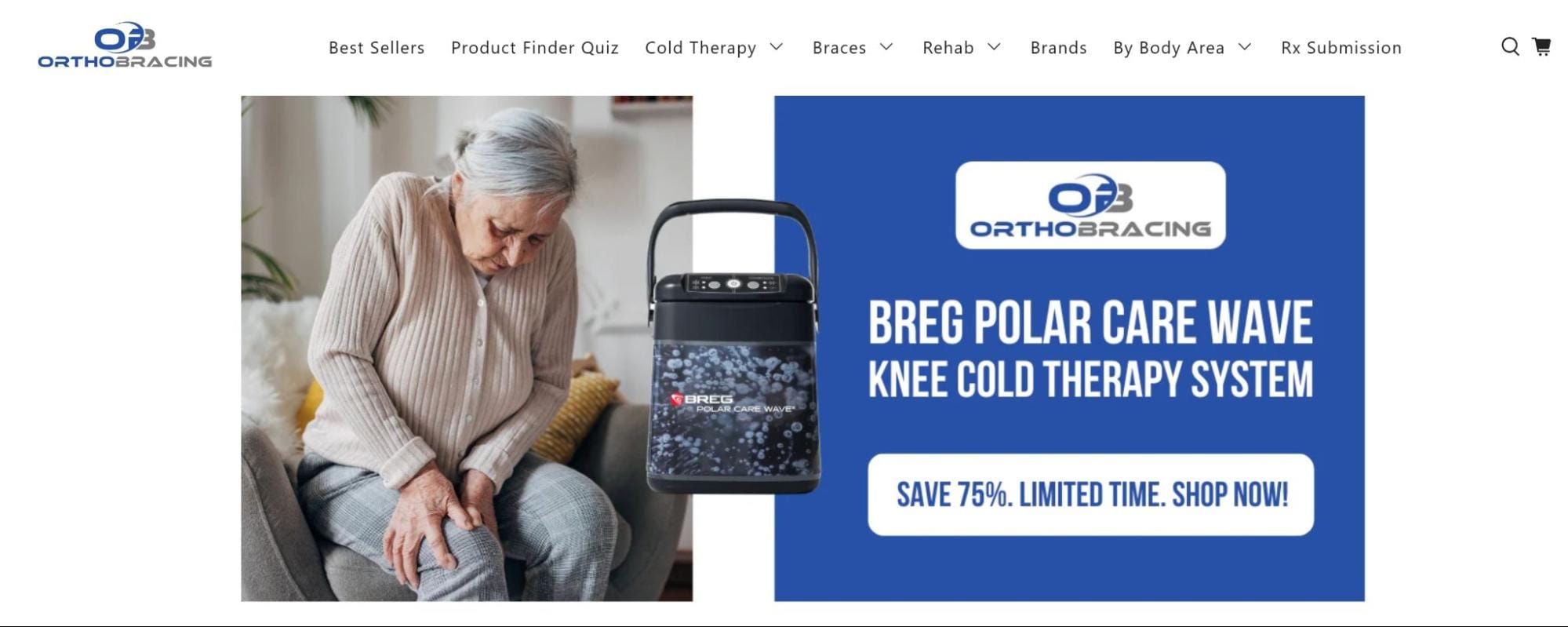
OrthoBracing, a company specializing in orthopedic support devices and recovery equipment, executes this strategy perfectly. Their homepage immediately displays their premier cold therapy system alongside an image of a recovery patient with whom their audience identifies.
They’ve carefully selected visuals that show their ideal customers (people recovering from surgery or injuries) using the product.
This direct approach means visitors instantly understand what OrthoBracing offers without scrolling or clicking through multiple pages. The messaging connects the product to its purpose within seconds, helping visitors determine if this solution matches their needs.
The results speak for themselves: when visitors can immediately identify what you’re selling and who it’s for, they’re more likely to engage further with your site.
So, don’t hide your best offers behind multiple clicks or make potential customers hunt for information.
2. Prioritize Addressing Common Customer Concerns
Trust barriers prevent first-time visitors from moving forward with you. Addressing potential objections upfront creates immediate confidence and removes hesitation from the buying process.
When visitors see you understand their concerns, they’re more willing to explore your offers.
This approach builds credibility quickly. Instead of letting doubts fester, you tackle them head-on, showing transparency and customer focus. It also streamlines the decision-making process by eliminating the need for visitors to search for answers to their pressing questions.
To get this right:
- Conduct customer research to identify the top 3-5 concerns about your products or services.
- Create concise trust signals that directly address these concerns.
- Position these trust elements prominently near your main offer or CTA.
- Use icons or visual cues to make each point stand out.
- Keep the language clear and benefit-focused.
- Back up claims with specific details (not just “high quality” but “tested to last 15+ years”).
- Consider adding a FAQ section that expands on these points.
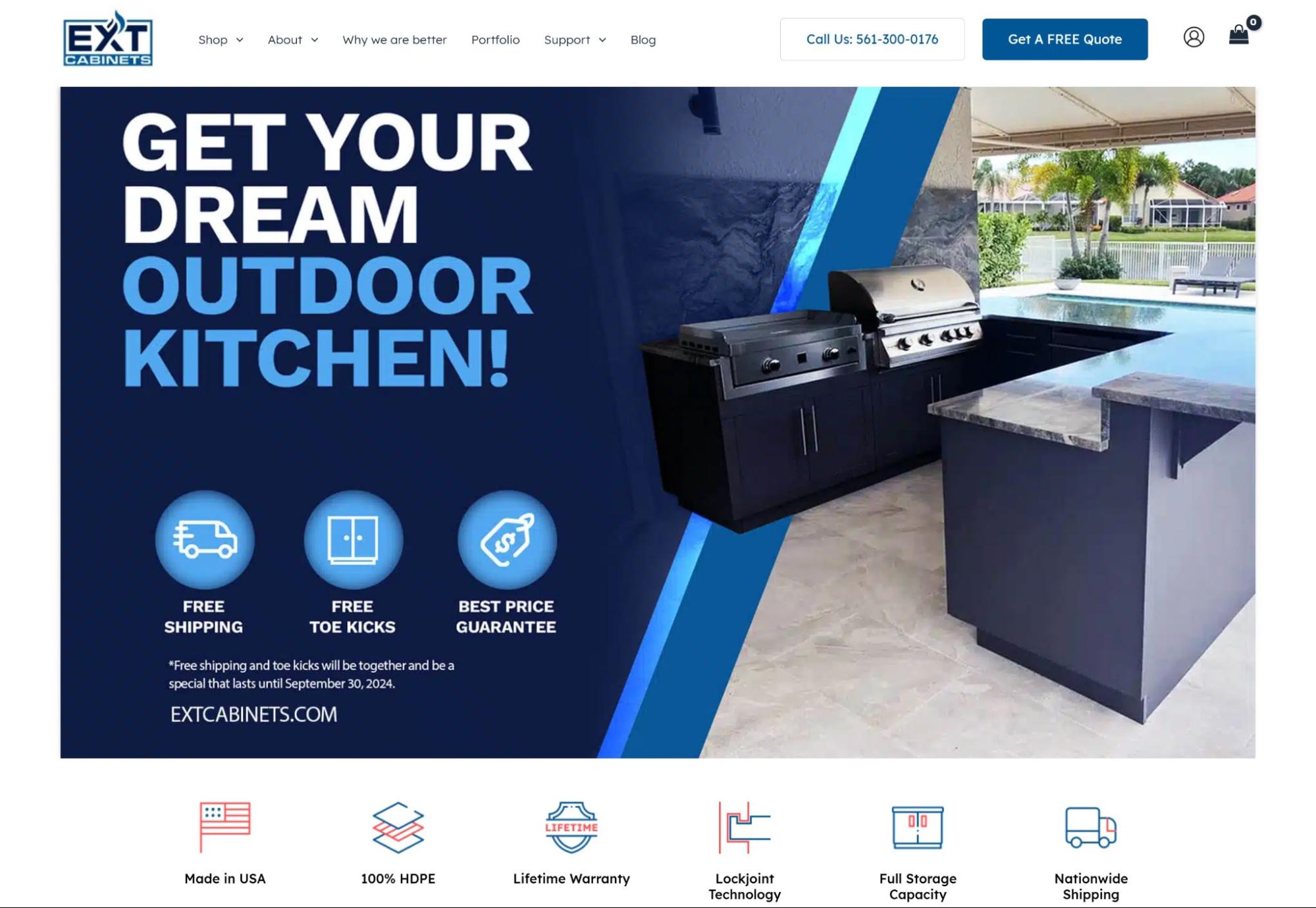
EXT Cabinets, a brand that offers weather-resistant outdoor kitchen storage solutions, nails this approach. Their homepage immediately displays multiple trust signals above the fold that tackle the exact concerns outdoor kitchen buyers have.
They highlight free nationwide shipping, their American manufacturing, price guarantee, and lifetime warranty. They also emphasize technical specifications that matter to their audience, like “100% HDPE” construction and features such as free toe kicks.
By addressing these concerns immediately, EXT Cabinets removes the friction that might prevent first-time visitors from considering their products. They’ve clearly listened to customer feedback and positioned their answers where visitors can’t miss them.
This works because it anticipates questions before they arise, making visitors feel understood and valued from their first interaction with the brand.
3. Show How Loyal Your Existing Customers Are to You
First-time visitors crave validation that they’re making the right choice. That becomes obvious when you learn that over 9 out of 10 customers check reviews online before making decisions.
By showcasing satisfied customers directly on your website, you control the narrative and build trust instantly, rather than letting prospects wander off to third-party review sites where they might get distracted.
Social proof works because humans naturally look to others for guidance when making decisions. When visitors see people like themselves having positive experiences with your brand, they’re more likely to envision themselves as customers, too. It reduces perceived risk and provides the confidence needed to move forward.
To get this right:
- Collect diverse testimonials focusing on specific results and benefits.
- Feature those that address common objections or pain points.
- Include customer names, photos, and relevant credentials when possible.
- Place testimonials strategically near decision points on your website.
- Keep testimonials concise and easy to scan.
- Rotate fresh testimonials regularly to keep content current.
- Group testimonials by customer type or problem solved.
- Include specific numbers or metrics when available.
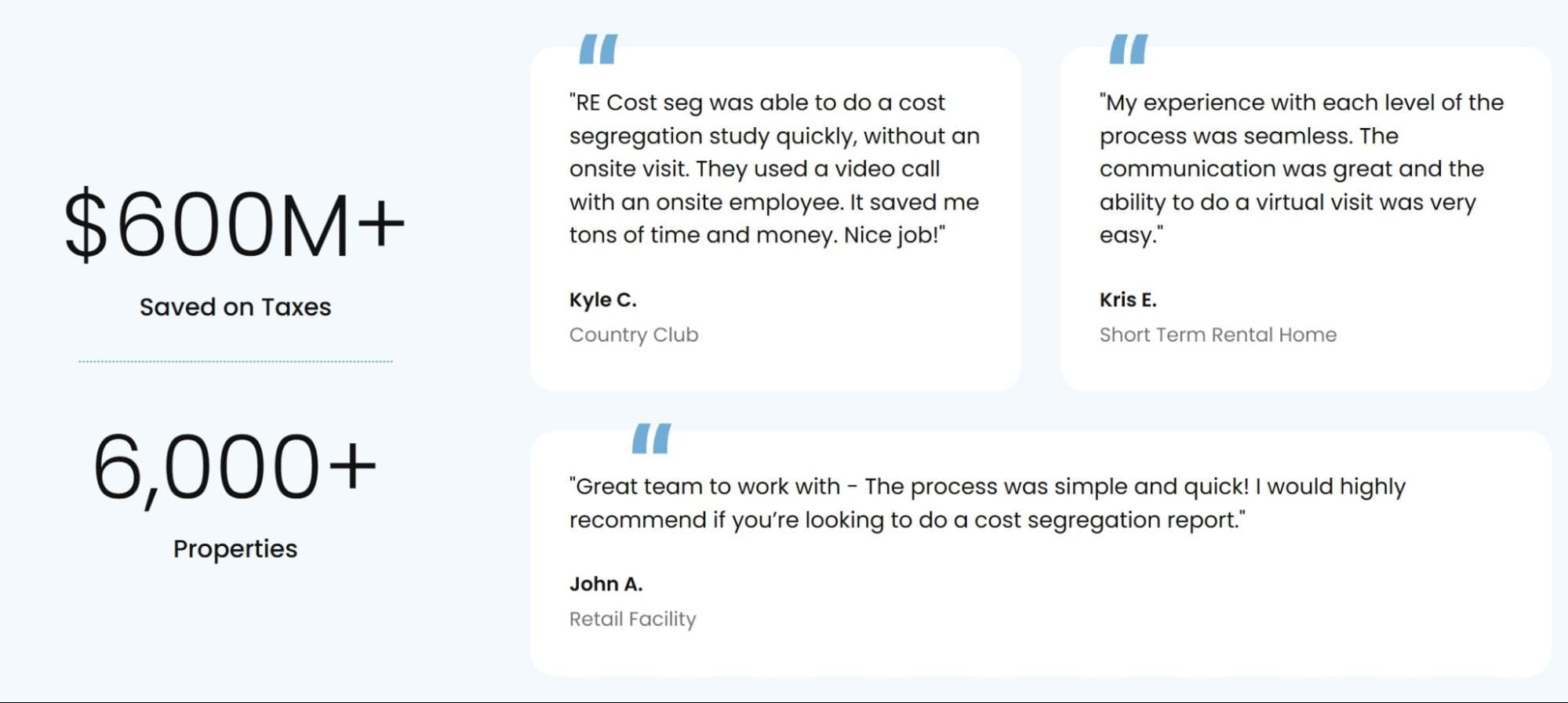
RE Cost Seg, a firm specializing in tax-saving strategies for real estate owners through cost segregation studies, masters this tactic. Their homepage prominently displays testimonials from property investors who have used their services.
These testimonials praise the company while specifically addressing the concerns other property owners might have. Customers mention the substantial tax savings they achieved, the smooth process, and the professional guidance they received throughout.
By highlighting these experiences, RE Cost Seg helps new visitors see themselves achieving similar results.
What makes their approach particularly effective is how the testimonials align with visitor pain points. When potential clients see others in similar situations who’ve saved thousands in taxes, they’re more inclined to explore further rather than continuing their search elsewhere.
4. Don’t Tuck Away Your Special Offers
Special offers create urgency and give first-time visitors a compelling reason to engage with your brand immediately.
When visitors discover a limited-time deal or exclusive discount, they’re more likely to take action rather than postpone their decision. Hidden offers might never be seen by visitors who don’t explore your site deeply.
Prominently displayed offers work because they tap into the psychology of opportunity. They transform browsers into buyers by adding value at the critical first-impression stage. They also help differentiate your brand in competitive markets where visitors might be comparing several options simultaneously.
To get this right:
- Position offers in high-visibility areas like headers or prominent banners.
- Use contrasting colors or design elements to make offers stand out.
- Include clear expiration dates to create urgency.
- Tailor offers to address specific customer needs or pain points.
- Keep the language simple and benefit-focused.
- Make redemption easy with one-click access or automatic application.
- Test different offer types to see what resonates with your audience.
- Update offers regularly to maintain freshness and relevance.
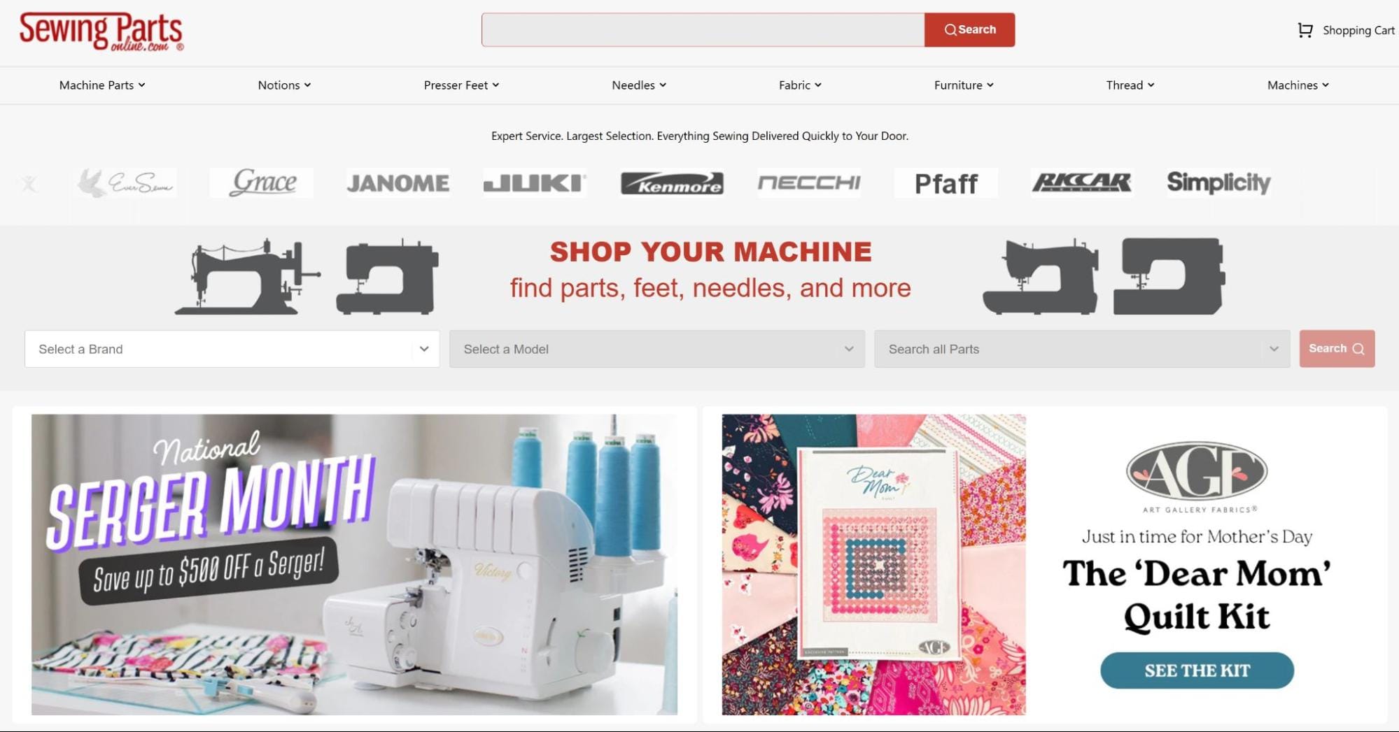
Sewing Parts Online, a retailer selling sewing equipment, components, and crafting materials, does this brilliantly. Their site places two prominent special offers directly beneath their main navigation bar, where visitors can’t miss them.
The first offer highlights exclusive discounts on a premium sewing machine brand that their core audience of dedicated sewers and quilters values. The second capitalizes on a seasonal opportunity with Mother’s Day specials carefully curated for their community of crafting enthusiasts.
By positioning these offers front and center, Sewing Parts Online immediately communicates value to first-time visitors. They’ve strategically aligned their promotions with their audience’s interests and needs, making visitors feel they’ve discovered something valuable right away.
This method gives new visitors a clear entry point into their sales funnel and a specific reason to browse products now rather than later.
5. Provide Immediate Human Contact
When selling something online, building personal connections can make a massive difference. For instance, visitors who engage with live chat are 513% more likely to convert to customers compared to those who don’t.
This fascinating statistic highlights how important real human interaction remains, even in online shopping experiences.
Immediate access to support works because it removes uncertainty at critical decision points. When questions arise (for example, about product features, shipping policies, or recommendations), waiting for email responses can kill momentum and lead to abandoned carts. Live chat bridges this gap instantly.
To get this right:
- Place your chat option prominently where visitors can easily spot it.
- Staff chat with knowledgeable team members who understand your products.
- Set realistic expectations about response times during and after business hours.
- Train staff to identify sales opportunities within support conversations.
- Personalize the experience by using names and conversational language.
- Equip agents with quick access to product information and common questions.
- Program relevant automated responses for after-hours inquiries.
- Follow up on chat conversations with helpful resources or special offers.
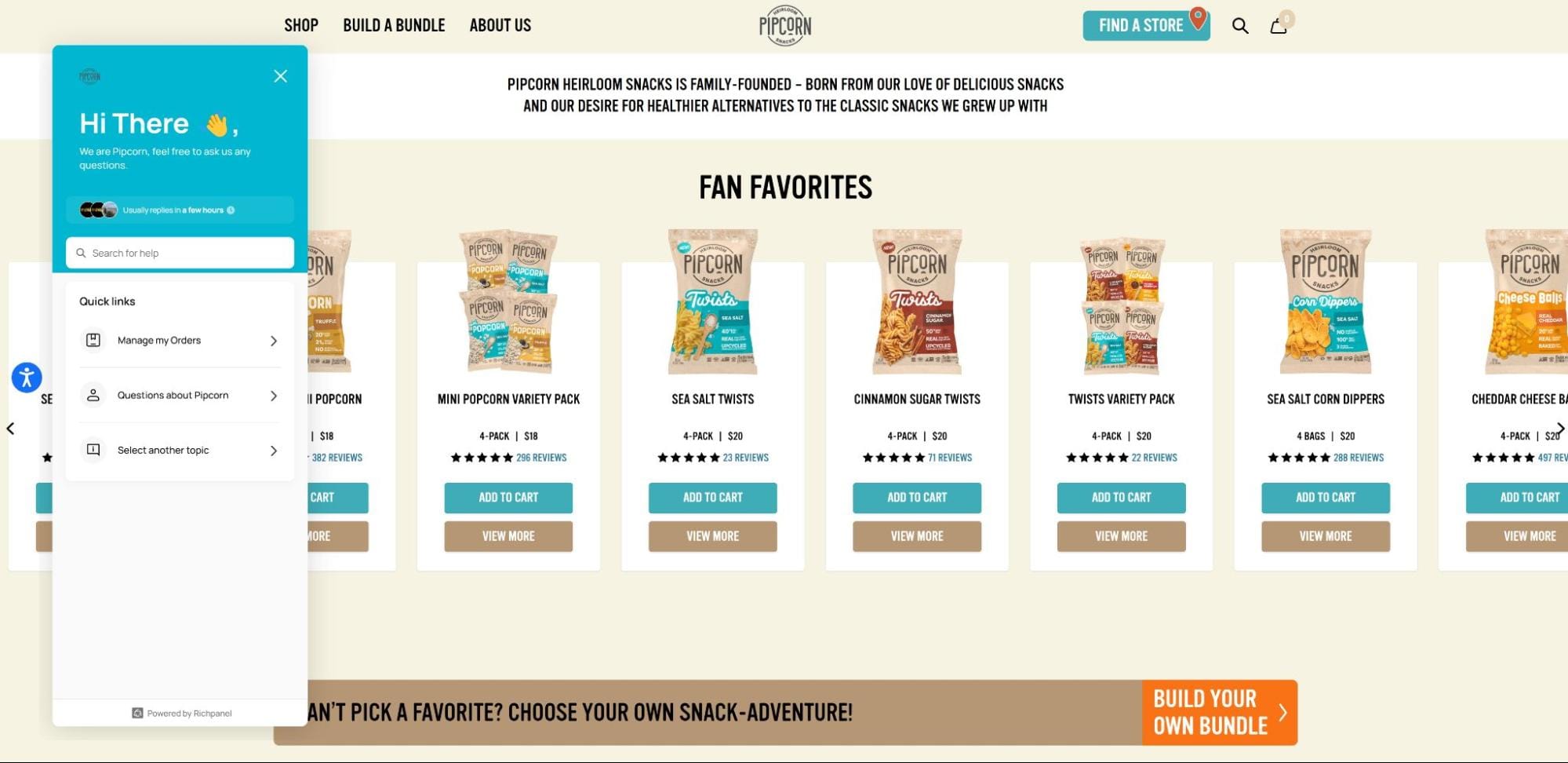
A brand that excels at this is Pipcorn, which offers better-for-you snacks made with sustainable ingredients. Their website features a consistently available chat function in the lower right corner that visitors can access with one click.
This tool connects shoppers directly with actual support staff who can answer specific questions about their heirloom corn products, ingredient sourcing, or order status. The immediate availability transforms potential confusion into clarity.
What makes their strategy so effective is how seamlessly it integrates into the shopping experience. Visitors browsing their healthy snack options don’t need to search for contact information or navigate away from product pages to get assistance.
Providing this direct line of communication allows Pipcorn to create trust and demonstrate their commitment to customer service from the very first interaction. This helps to significantly increase the likelihood that first-time visitors will complete their purchase.
Final Thoughts
Most first-time visitors won’t take action unless you give them a reason and make it easy.
Every tactic here does exactly that. None are complicated, and all are grounded in what real people actually need when they land on your site for the first time.
So, the next step isn’t about doing more. It’s about doing what matters – clearly, confidently, and upfront. Because if your site speaks to your audience from the start, the right people won’t just visit. They’ll stay, engage, and move forward.
