
The header of your website’s homepage is the first thing your leads will see. As you naturally want this first impression to go off without a hitch, you might be stuck trying to figure out a simple but effective design that will encourage visitors to keep scrolling.
Consider these nine header design tips which will help you generate more conversions:
Make It Clean
The first rule of conversion-oriented header design is to keep it clean and simple. You don’t want to overwhelm your visitors with too much information. You do, however, want them to understand who you are and what you do.
The best way to tell you how to achieve this is to show you. Look at Lanteria.
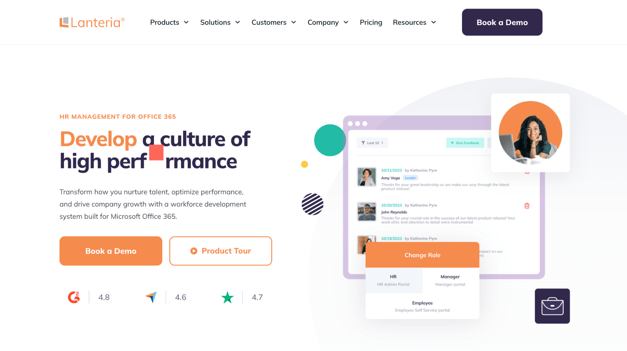
Their header relies on lots of negative space to direct the eye of the visitors toward the important elements. They have two CTAs catering to various types of leads. They have a clear value proposition that tells you what they do. They show you the product. And they have included social proof.
Despite this seemingly large number of elements, the header is light. The color choice also makes it vibrant and punchy.
Look at your own header and consider how information- and element-heavy it currently is. Can you remove something? Can you shorten your sentences? Can you move an element further down the page?
Provide Easy Navigation
One of the purposes of your homepage header is to provide navigation. If your menu is too complicated or too confusing, chances are visitors won’t be that interested in exploring further.
When designing your menu, you will need to consider two things: what your audience is looking for and what you do. The crossroads of these two ideas is the menu itself.
Use words your audience uses when searching for what you provide. You don’t need to do excessive keyword research. Just put your common sense hat on.
Categorize your menu items in the most logical ways. If you have lots of product categories, make the most popular ones more prominent.
Look at Digestive Warrior. They have a “shop” category in their menu that lists all the brands they stock. This is a great solution for customers who are looking for a specific product. It’s also a great way to rank for all these branded keywords.
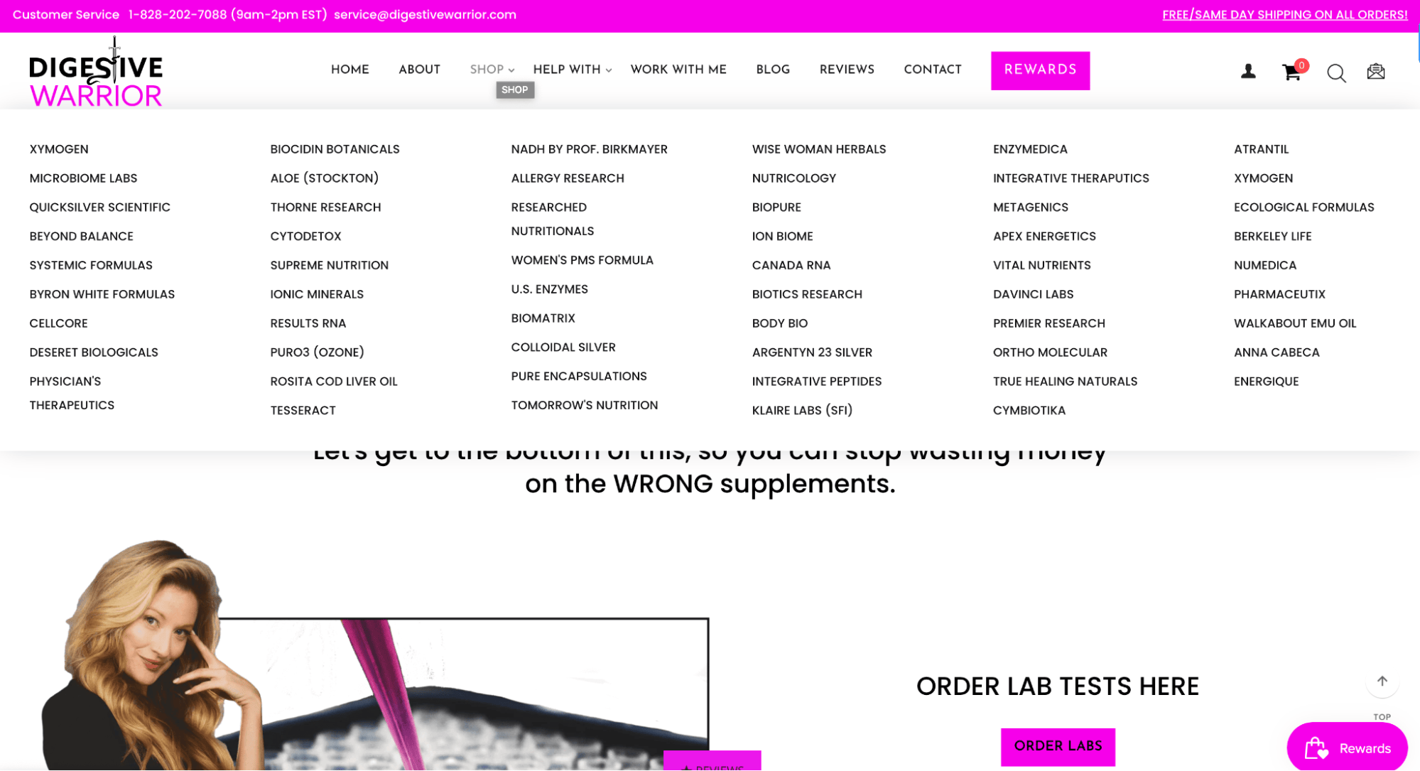
They also have a “help with” category. This one appeals to customers who don’t know what they need but have a specific problem they want to solve. From an SEO standpoint, this is, again, a great way to rank for relevant, broad terms.
Have Two CTAs
The CTA is undoubtedly one of the most important elements of a header. It provides a fast and simple way for a visitor to get what they want. They don’t have to spend time scrolling to get to a conversion opportunity.
Ideally, you want to place two CTAs in your header. Having only one will feel limiting, and visitors will feel they only have one choice.
One of these CTAs should be a direct route to conversion. It can lead to your shop, or it can lead to a contact form if you offer a digital marketing service. The other should be an informative CTA. It can lead to a service page or a guide: a piece of content that will educate your visitors.
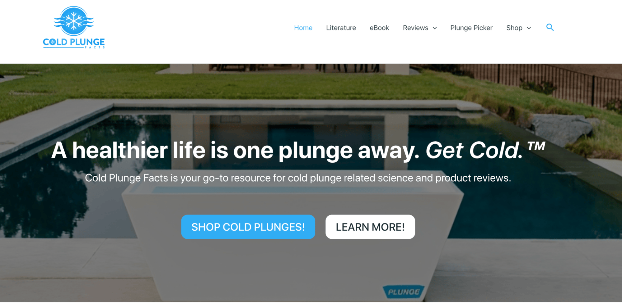
Cold Plunge Facts has used this strategy well. One of their CTAs leads to their general shop page, where customers can browse their product categories. The other leads to their blog, where you can learn more about cold plunges and their benefits.
Provide Key Information
Your homepage header can (and should) also be used to display some key information about your website and your brand.
Think of it as a business card. You want to place all of the information a visitor might need here so they don’t have to scroll down and look for it.
This is also a great tactic for making your brand more legitimate and trustworthy. If you are a small business or if you are just starting out, customers are likely to have qualms about converting. What if you are not a real business?
Similarly, you will signal to search engines that you are a real, trustworthy business.
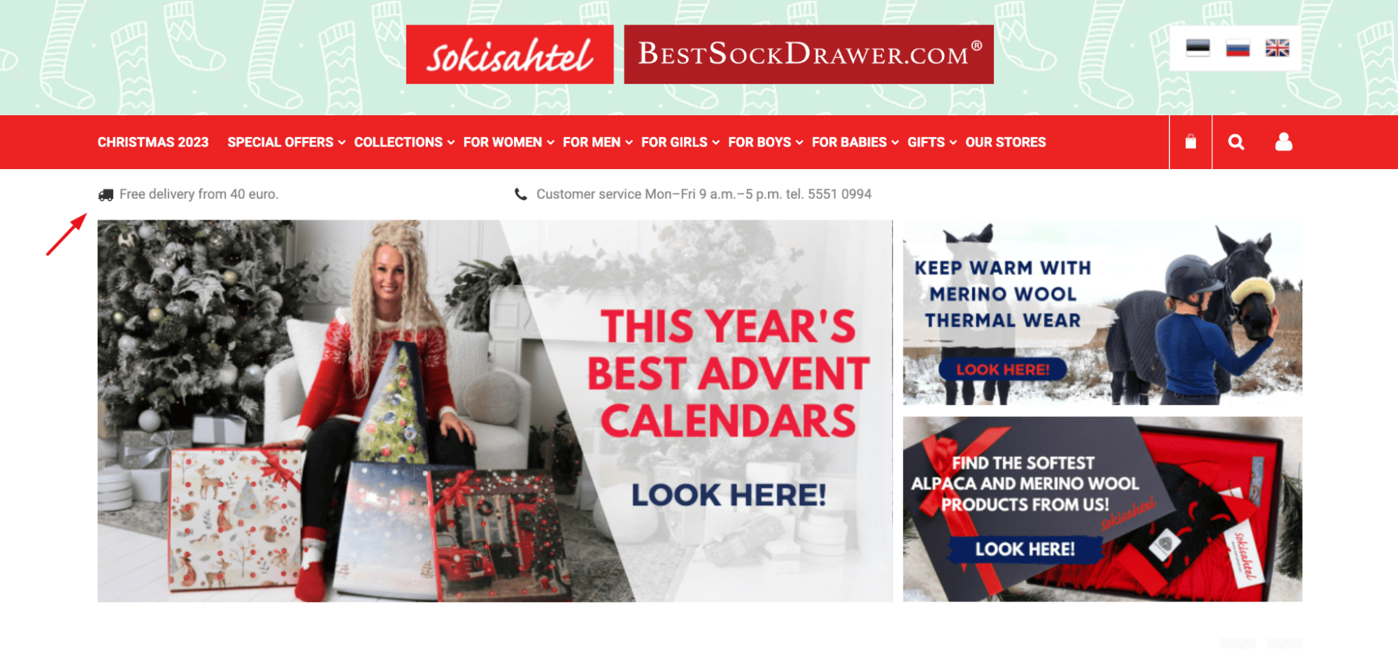
Sokisahtel is a good example to check out. They have listed their free delivery threshold in the homepage header. This is a great way to overcome common conversion obstacles. They have also listed the working hours of their customer service and their telephone number. This proves they are a real brand, with real humans answering the phone.
Have a Great Value Proposition
Your header should also be home to your value proposition. This is what will make you stand out from your competitors and make you memorable.
In order to write a great value proposition, start by thinking about the problem your customers are trying to solve. Since there is likely to be more than one, list them all for brainstorming purposes.
Then think about your solution and the benefits it provides. Why should anyone work with you? Write down as many words as you can think of that describe the benefits of converting. Focus on the value for the customer.
All you have to do now is connect the problem with the value and benefits, and you have a great value proposition.
Check out NoCry. Their “safety work gear you can trust” sums up the entire brand in the most effective word possible: trust. They then also compliment the customer by telling them they work hard (and that their product will be able to keep up).
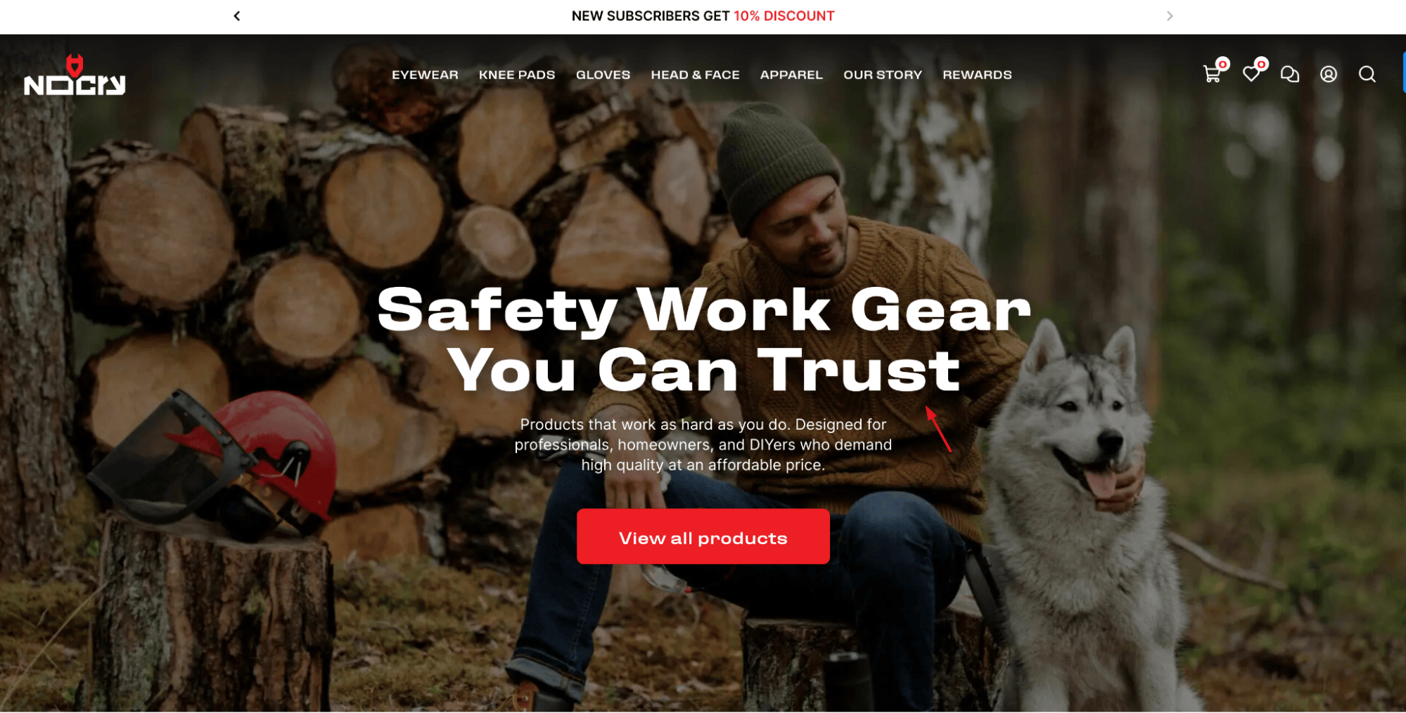
Finally, they specifically list the type of customer their brand is for: professionals and DIYers alike.
Add a Search Feature
Having a search feature in your header can significantly boost conversion rates, as visitors are able to find what they are looking for in a matter of seconds.
It’s not an element that every type of website will need, though. For example, if you are a service-based business, you probably won’t need it.
If you are an ecommerce business, it’s best to incorporate a search bar into your main menu. Customers will expect it to be there, and you will have plenty of header space to use for other elements.
However, if you’re a travel agency, for example, or a house-sitting platform, or if you offer lots of online courses, the search feature can be a great asset.
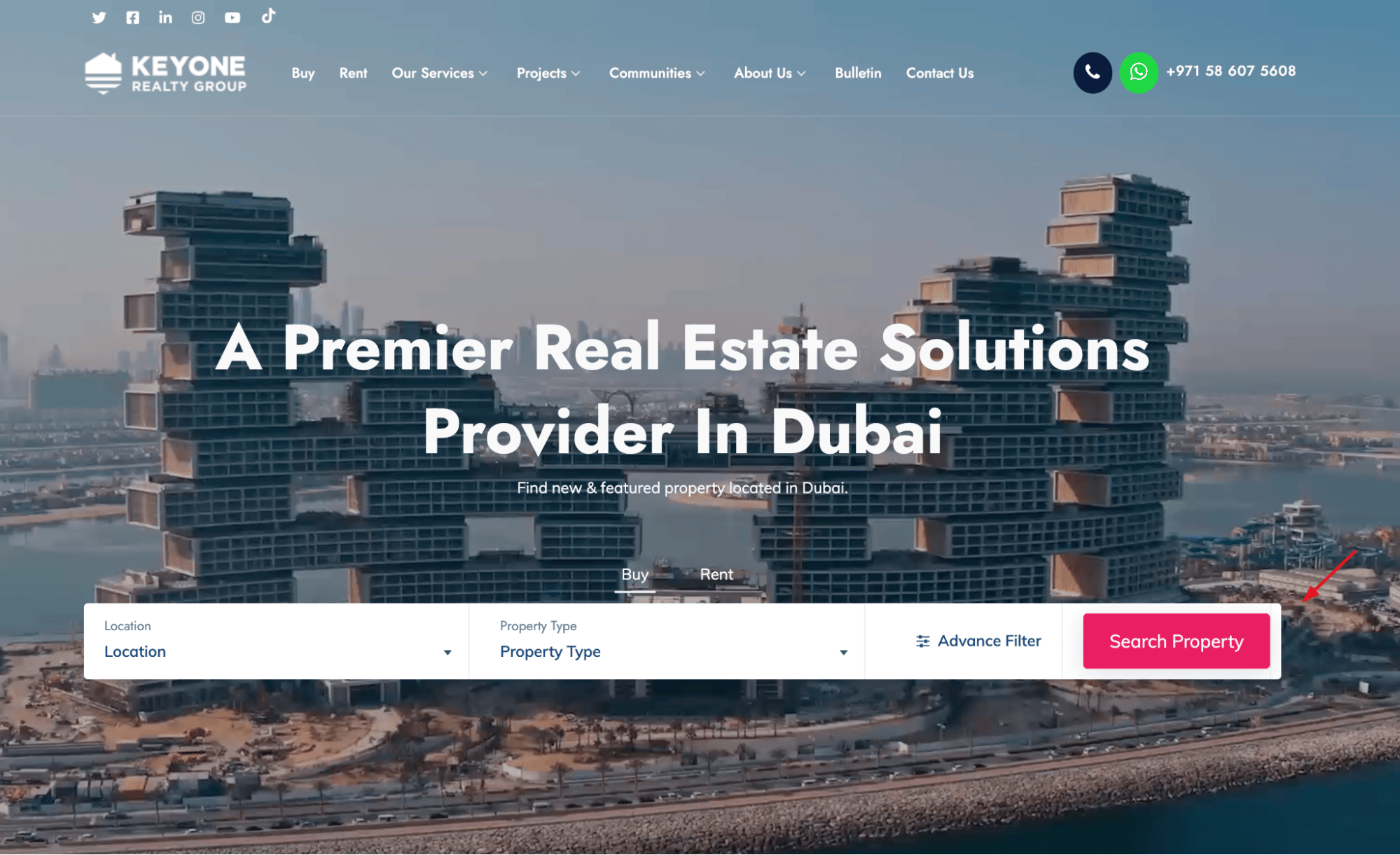
Take a look at Keyone Realty Group. Their header consists of a value proposition and a search bar, which essentially serves as a CTA. It allows customers to instantly start browsing their offer, tailored to their specific requirements.
Highlight the Current Offer
You can also think of your header as advertising space. Since this is the first thing visitors see, you can use it to promote your latest products, your current sales, and so on. You can also promote products you want to sell more of or products people might not know you stock.
By changing up your header design seasonally or periodically, you will also keep it interesting. Even if you are not an ecommerce brand and you always offer the same thing, change your header once in a while. You might find a certain design works significantly better than another.
Check out ModCloth for a good example of seasonal header design. They are currently promoting their Black Friday and Cyber Monday deals with a banner and flyer design online. It is naturally short-lived, as these sales only last a couple of days.
Below, they are promoting their holiday offer. This banner is likely to stay until the end of the year when it will be replaced by the next one.
Animate It
Ideally, you also want to add a bit of interest and a bit of movement to your homepage header. It doesn’t have to be much. Just a tiny little element that will make the page more vibrant and less static.
Of course, there’s nothing wrong with a static header. In fact, it is recommended for brands that want to appear professional and highly respectable. For example, a corporate law firm should not animate its header.
If you operate in a more laid-back industry, however, consider whether you can make a certain part of the header move.
Visme does it very well, for example. Their value proposition is animated, and it keeps throwing out relevant descriptions of the variety of options their solution provides. Since they are a design platform, it makes absolute sense to have a more vibrant header.
Also, this solution helps them overcome the limitations of a static value proposition. Using just one word to describe the effects their tool can help users achieve would not be nearly as effective.
Showcase Social Proof
Another conversion-oriented element you can include in your homepage header is social proof. This is a great way to demonstrate expertise and credibility. It will overcome a lot of the most common conversion obstacles and help you build trust with your visitors.
The kinds of social proof you use will depend on the nature of your business. Testimonials and reviews always work well, as does showing the logos of the brands you have worked with in the past.
Semrush does a great job of social proof. On their homepage they showcase some of the brands that use their tool. These are all well known brands around the world and as a result this adds instant credibility.